6 skills for young web developer

This expert advice for web developer will help give you that competitive edge.

web developer

While it can be difficult to develop hard skills from scratch. It’s certainly not as difficult to hone your skills (including those softer skills) competitive edge. Learning can take many different forms, so what can the web developers of tomorrow do to get ahead?

Six expert authors and web developer what they think graduates and young web developer can do to give themselves a headstart. Here’s what they had to say:

  1. Specialize, don’t diversify

Harold Dost, principal consultant at Raastech suggests that young developers take some time to look at tools such as Lynda or Linux Academy. He stresses that tools such as these can be used to develop a strong foundation of knowledge on a key topics and can help you on your journey in becoming an expert.

“Hone a core skill (maybe two or three), and then diversify on the rest,” Dost says. “This will allow you to specialize and give you the in-depth knowledge which will be necessary as you go further in your career.”

But he also says that although you should specialize in a few areas, be careful not to neglect other opportunities. “At the same time as specializing,” Dost says, “be sure to keep learning about new technologies to allow you to grow and improve the work you produce.”

  1. Read and write (and write more than just code)

Oracle ace director and principal at Capgemini UK says My advice for young web developers would be to be passionate about learning and, of course, about coding.”

He also thinks that even though his industry is all about new technologies. Good old fashioned reading will always be the most important part of education.
Reading books is surely a way to get ahead. he says, “as well as lots of other interactive ways to learn like youtube, blogs, online courses and so on.”

But even though there are so many interactive ways of learning. Luis thinks that reading books is one of the most important elements of personal development. “Not only does a huge amount of effort go into writing books,” he says, “but nothing beats a good book to read whilst on the train, or bus. Bringing a book with you wherever you go means you’re always equipped to learn.”

  1. Take up meditation. No, really.

Perhaps the most frustrating thing about working in IT and tech is the non-stop nature of the industry. It’s easy for those just finding their feet in a constantly moving world to feel overwhelmed. Author Sten Vesterli says that the most critical skill to learn is “to manage your energy, and find ways to replenish it when it’s running low.”

If you have high energy, you can learn any skill and it will remain employable.

“But if you have high energy,” he explains, “you can learn any skill and it will remain employable. If you have low energy, you will have a hard time learning something new. And it will be in danger of being left behind by technological changes.”

But how does Vesterli make sure that he’s energized enough to keep up to date with the pace of change? “I’ve found that meditation and triathlons work for me,” he says, “but others will have different things that give them energy.”

  1. Question everything and gain a deeper understanding

Phil Wilkins, author and senior consultant at Capgemini thinks that sometimes the tech industry is a bit quick to move onto the next fad. He says that as graduates gain experience, they should challenge the work they are doing. And the tools they are using to make sure that they are always trying to influence things for the better. Not only will this help new developers stand out to their employers, but will help them to learn.

“Questioning why something is a good answer to a problem is as important as to how to answer the problem.” Wilkins adds. “Understanding this may not make you a guru, but it will give you a foundation to work with peers in an engaging manner and set you up for future success. Ultimately IT is here to solve problems, and knowing why certain things are good answers rather than that they simply are good answers, means you stand the best chance of developing good solutions.”

  1. Get networking

It’s a frustrating stereotype that tech types aren’t social beings. One tip suggested by Packt’s experts was to realize that putting yourself out into the real world. So that you can get a great way to move ahead. As cliché as it is, networking is a simple way of getting a foot in the industry.

Whether you attend events organized by your university of college, or connect with people who interest you on LinkedIn, networking is a crucial skill – particularly if you ever consider going freelance. Adrian Ward says that aside from writing, he has one other crucial bits of advice for graduates: network. “Just get involved with the community,” he says.

  1. Apply for the right jobs – but don’t just rely on your bosses for your training

Robert van Mölken, author and senior Integration and cloud specialist for AMIS says that graduates seeking employment should actively look for companies that invest in their developers to keep them up to date with innovations.

“Things are changing so fast these days. You can’t sit still if you want to be relevant in two years time. He says. “Companies that allow their developers to go to conferences, both locally and further afield. They will find that they will learn upcoming skills much faster, going beyond the point of knowledge you can get from investing in and learning from books.”

However, van Mölken also says that developers shouldn’t just rely on their bosses giving them opportunities. They should find them for themselves.Invest some personal time to experiment with new technologies and IT innovations. he advises. “Don’t fall behind on stuff just because you are comfortable with what you do every day at work. Find opportunities to speak up, to give presentation about what you learned, and share your experiences. Then you will get noticed, and a world of possibilities will open up to you.”


6 skills for young web developer

Need a website

 Some reasons creative professionals need a site

need a website

Surprisingly, there are still some creative professionals without a website. By the way, having a Facebook page doesn’t mean you have a site. And yes, you should have both!

So, let’s take a look at some of the reasons why you need a website.

1.To build your brand

One of the biggest reasons for having your own website is to help build your personal brand. In the past, branding was reserved for larger corporations, like Disney and Pixar. But nowadays, with social media lurking in every corner, personal branding should not be overlooked.

2.To showcase your work

need a website


Having complete control over how your online portfolio looks gives you freedom to express yourself

Let’s face it, if you want new gigs, you’ll need to show off your stuff. While there are a number of online portfolio sites where you can post your work, having your own site comes with many benefits, such as being able to set yourself apart from the rest.

3.To make yourself available

It doesn’t matter what time your work day ends, your website is always available to existing customers and potential clients. Besides, people expect you to have a website. Without one, they might not even know you exist.

4.To establish credibility

A website can help you establish credibility within your field. It’s a place you can share your credentials, client testimonials, and blog posts or tutorials.

5.To keep up with the competition

Not having a website is like handing over your leads to the competition. When potential clients search the web for services you offer, wouldn’t it be nice to have your name included in the results?

6.It’s great for networking

great for networking

 Stay connected and help build your professional network

Websites are great for making connections. Having a simple way for fans to keep in touch helps you grow your audience and your network.

7.To save time and money

Believe it or not, having your own website can actually save you time and money. That’s right! Maintaining a website doesn’t have to be expensive, especially if you can learn how to do it on your own.

Note: When you use your website as a sales and marketing tool, you’ll quickly see how the return-on-investment is generally higher than other advertising options.

8.To gain control over the look and feel

Online portfolio sites are great, but how much of the design can you control? While there are a few that offer seemingly endless possibilities, nothing takes the place of having your own site that you can design to meet your needs. This is also great for helping to build a consistent look for your personal brand.

9.It’s not Facebook, Instagram, or Twitter!

social network

Using Facebook, Instagram, and Twitter isn’t enough

Facebook, Instagram, and Twitter are great. And you should use them to their fullest extent – but not everyone uses these services. Sometimes, the only way to reach out to people online is with your own website.

10.To learn a new skill

While learning a new skill might seem like the last reason to have a website, it’s an important one. When you’re able to learn new things, not only are you ‘working’ your brain, you’re also increasing your value in the workplace, while building your portfolio. Besides, learning is fun!

So now you know why you need a website. So it’s time to create your own website.


Need a website

Some reasons you should be using Atomic Design

If you’ve been in the frontend dev community for a while you have probably heard of a little thing called Atomic Design. Atomic Design is a methodology that involves breaking a website layout down into its basic components, which are then reused throughout the site .

There are many benefits to using Atomic Design.

9 important reasons you should use Atomic design
  1. You can mix and match components

By breaking down components into basic atoms it’s easy to see what parts of the site can be reused. And how they can be mixed and matched to form other molecules and even organisms.

Let’s say a site only contains five atoms: a small image, large image, paragraph, list item, and a link. You could create a very usable web page by duplicating and combining these atoms to make molecules.

  1. Creating a style guide is simple

If a site is created according to Atomic Design principles from the get-go. All the atoms and molecules that are created before the site is built can serve as a basic style guide. Even for sites that haven’t been built atomically. It isn’t difficult to extrapolate the basic components and put them together to construct more pages. Bear in mind, though, it is always best to create a site atomically from the beginning, rather than trying to introduce Atomic Design principles to a site later on.

  1. Easy to understand layout

The code of an atomically designed website is typically much easier to read than one created a more traditional way. This is true not only during the time of creation, but in the future when a site is being looked back on for reference or small tweaks. Because of the documentation around what atoms molecules and organisms are being used and where, it’s easy to see what each part of the code represents. Another bonus of this is that it makes it easier to explain the codebase to a new developer.

  1. Code is more consistent

With Atomic Design, you use predefined atoms to create the site layout, it is easy to see which components are being used for different parts of the site. This reduces the likelihood of writing duplicate code.

For example, if someone creates a site without using Atomic Design and they require, say, a red button, they would have to look through the whole site to try and find an existing one. If this did exist, they would need to copy and paste that code to the new instance. If there were no red buttons, they’d need to create a new one. With Atomic Design however, it is easy to go back through the list of atoms and find that exact red button.

  1. No focus on pixel-perfect designs

As the idea behind Atomic Design is to use atoms as the building blocks for site creation. It is less likely that a web developer will create many atoms for a similar thing. Instead, they can simply look through the list of existing atoms, and tweak them to create new atoms if required.

  1. Quicker prototyping

Having a list of atoms before site creation begins means you can mock up pages quickly and easily – all that is required is to pick and combine the required elements for the page. The mockup can then be customized and refined for the final site.

  1. Easier to update and remove parts of the site

As only one atom, molecule or organism is being changed at any one time, it is easy to ensure that any updates to a component are carried across to all other instances across the site. Similarly, unwanted components can easily be removed.

  1. More modular file structure

Although Atomic Design is very prevalent when it comes to markup (HTML). I believe these techniques can also be used for CSS, JavaScript, or any other languages. That is used to create a site to make overall code more modular and reusable.

  1. Fewer components overall

If a creator has a list of atoms, molecules and organisms presented to them before site creation begins. They are more likely to use what already exists than create new components for small variations. If a title  font size of 4.5em is required for a design but there is already a 4em size title in existence from the list of atoms. It is more likely a creator will pick the 4em one than create a completely new title. This will result in fewer atoms being used overall, making for a cleaner and leaner website.

Some reasons you should be using Atomic Design

What is Atomic Design

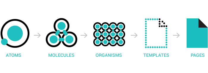
Atomic design is a methodology for creating design systems. There are five distinct levels in atomic design:

  1. Atoms
  2. Molecules
  3. Organisms
  4. Templates
  5. Pages

Let’s explore each stage in more detail.

Atomic design

Atoms

First level of atomic design is atoms. Atoms are the basic building blocks of matter. Applied to web interfaces, atoms are our HTML tags, such as a form label, an input or a button.

Atoms can also include more abstract elements like color palettes, fonts and even more invisible aspects of an interface like animations.

Like atoms in nature they’re fairly abstract and often not terribly useful on their own. However, they’re good as a reference in the context of a pattern library as you can see all your global styles laid out at a glance.

Molecules

Second level of atomic design is molecules. Things start getting more interesting and tangible when we start combining atoms together. Molecules are groups of atoms bonded together and are the smallest fundamental units of a compound. These molecules take on their own properties and serve as the backbone of our design systems.

For example, a form label, input or button aren’t too useful by themselves, but combine them together as a form and now they can actually do something together.

Building up to molecules from atoms encourages a “do one thing and do it well” mentality. While molecules can be complex, as a rule of thumb they are relatively simple combinations of atoms built for reuse.

Organisms

Third level of atomic design is organisms. Molecules give us some building blocks to work with, and we can now combine them together to form organisms. Organisms are groups of molecules joined together to form a relatively complex, distinct section of an interface.

We’re starting to get increasingly concrete. A client might not be terribly interested in the molecules of a design system, but with organisms we can see the final interface beginning to take shape.

Organisms can consist of similar and/or different molecule types. For example, a masthead organism might consist of diverse components like a logo, primary navigation, search form, and list of social media channels. But a “product grid” organism might consist of the same molecule (possibly containing a product image, product title and price) repeated over and over again.

Building up from molecules to organisms encourages creating standalone, portable, reusable components.

Templates

Fourth level of atomic design is templates. At the template stage, we break our chemistry analogy to get into language that makes more sense to our clients and our final output. Templates consist mostly of groups of organisms stitched together to form pages. It’s here where we start to see the design coming together and start seeing things like layout in action.

Templates are very concrete and provide context to all these relatively abstract molecules and organisms. Templates are also where clients start seeing the final design in place. In my experience working with this methodology, templates begin their life as HTML wireframes, but over time increase fidelity to ultimately become the final deliverable.

Pages

Fifth level of atomic design is pages. Pages are specific instances of templates. Here, placeholder content is replaced with real representative content to give an accurate depiction of what a user will ultimately see.

Pages are the highest level of fidelity and because they’re the most tangible, it’s typically where most people in the process spend most of their time and what most reviews revolve around.

The page stage is essential as it’s where we test the effectiveness of the design system. Viewing everything in context allows us to loop back to modify our molecules, organisms, and templates to better address the real context of the design.

Pages are also the place to test variations in templates. For example, you might want to articulate what a headline containing 40 characters looks like, but also demonstrate what 340 characters looks like. What does it look like when a user has one item in their shopping cart versus 10 items with a discount code applied? Again, these specific instances influence how we loop back through and construct our system.


Website Design

Atomic design

What is Atomic Design

Create a responsive layout with CSS Grid

CSS Grid Layout is growing in browser support every day and we can ship CSS Grid to production. The quick adoption of CSS Grid has been truly remarkable.

Before we get to making a responsive portfolio site layout with CSS Grid, let’s clear a couple things up first: CSS Grid is not a replacement for Flexbox. It’s not even a replacement for floats. In fact, you might realise that we’ve been using Flexbox to do things that CSS Grid does much better. But instead of thinking in terms of replacement, we can think in terms of combination.

Imagine a peanut butter and jelly sandwich. Peanut butter and jelly are pretty great on their own, but when they come together, a new thing is born and magic happens.

This is what our layout tools are like. They are great at the things they do individually, but when they’re combined, magic happens and we can create new and exciting layouts. In this instance, we’ll make a web development PB&J of our own with CSS 
Grid and Flexbox.

  1. Set up your markup

Our layout doesn’t look like much, but the skeleton with our six items is in place.

In this tutorial we’re going to use CSS Grid and Flexbox together to create a responsive portfolio layout. Each of these boxes are a different size, some of them span across rows and each box has a title that sits at the bottom. We’ll use some of the great alignment tools that come with Flexbox to make that happen.

Let’s start by setting up our markup.

<ul class=”boxes”>

<li>

<div class=”boxes__text-wrapper”>

<h2>Case Study Title</h2>

<p>A catchy description for our case study. We worked hard.</p>

</div>

</li>

</ul>

We’ll duplicate that list item and everything in it six times so we have items to play with. In case you’re wondering, we’ve decided to use the ul element here because this is a list of entries. Feel free to use whatever feels right to you.

Inside of the list item we have a div with the class of .boxes__text-wrapper that will contain the title of the case study and its accompanying description.

  1. Write base styles

We’ve set our font to something a bit nicer and removed the default margin from headings and paragraphs

Now let’s set some base styles to work with.

body {

font-family: Avenir, sans-serif;

margin: 2rem auto;

width: 95%;

}

h2,

p {

margin: 0;

}

ul {

list-style: none;

padding: 0;

margin: 0;

}

.boxes > * {

padding: .5rem;

background-color: #333;

color: white;

}

We’ve changed the font to be Avenir. We’ll remove margin from our heading and paragraph, and reset the unordered list. We’ll also give each list item some default styles to help us see where each one is.

  1. Set up your grid

With only three lines, we’ve added a gutter between our Grid items and made them a bit taller

We want to build our layout for mobile first. Setting up our grid on small screens is as easy as this:

.boxes {

display: grid;

grid-auto-rows: minmax(125px, auto);

grid-gap: .5rem;

}


web design

Grid will stack our items on top of one another because by default there is only one column. We’ll create some space between each case study by using grid-gap – this lets us add a gutter between rows and columns.

Forget adding a margin to columns only to need complex nth-child selectors; gutters only appear between columns or rows, never after or before a column or row.grid-gap is the shorthand of 
grid-column-gap and grid-row-gap. Usually we’d use the longhand, but we’re going to overwrite both as the browser grows so we’ll use the shorthand.

Next, we’ll use grid-auto-rows to tell our grid container the height of new rows. Grid will create new rows to place all of our content. We can control the size of these automatically-created rows with the grid-auto-rows property. We’re using a new function available to us: minmax(). With minmax() we can 
specify a minimum size and a maximum size.

With our code we’re saying that we want our rows to be a minimum of 120px and a maximum of auto. We’re using auto here because we want our rows to grow if the content warrants it.

  1. Set up large browser compatibility

Our grid is taking shape! We have six columns to work with and less gutter between our grid items

Let’s set up our page so that when our browser is 40em or larger, our grid container has six 
columns of one fraction each.

@media screen and (min-width: 40em) {

.boxes {

grid-template-columns: repeat(6, 1fr);

grid-gap: 2px;

}

}


grid-template-columns is the property we use to tell our grid how many columns should exist. It accepts all the length units we know and love such as rem, em, px, percentages, 
vw, vh and fr.

The fr is a new unit that we get with CSS Grid Layout. With it, we can tell the browser to do maths instead of us – excellent.

By telling the browser to create six columns of one fraction, the browser will calculate the width of our grid container and split it into six equal columns. Also, because Grid is smart, it’ll only divide the space left over after calculating the gutter that we specified.

  1. Style individual items

Coffee makes everything look nicer doesn’t it? Also the subtle gradient makes our title and description stand out

Our case studies look a little drab as just grey boxes. Let’s add a background image, get our titles to display at the bottom of these boxes and add a gradient so that our title stands out.

.boxes li {

background-image:

linear-gradient(rgba(0,0,0,0), rgba(0,0,0,0.8)),

url(path/to/image);

background-size: cover;

display: flex;

align-items: flex-end;

}

I’m also bringing Flexbox into the mix to align our text to the bottom of our boxes. You won’t see that yet, but as we place each different box you’ll eventually see it work.

  1. Place items on the Grid

Grid makes it insanely easy to size our Grid items however we’d like. But this is only the beginning

Unfortunately, Grid does not have a way to automatically place items in the grid layout that we saw at the beginning. Fortunately for us, however, Grid does give us the tools to do it manually quite easily. In this tutorial we’ll use nth-child to place each list item. In a production website we would advise to use a class that, given the right planning, could make it possible to automate layouts like this in a content-heavy site.

Let’s get started with our first item.

@media screen and (min-width: 40em) {

.boxes li:nth-child(1) {

grid-column: 1 / -1;

grid-row: span 3;

}

}

We’ll be putting all of our placement styles inside of that media query we wrote earlier because we want this layout to happen after our browser is 40em or larger. With nth-child we’re targeting the first list item. CSS Grid lets us easily place our items with 
grid-column and grid-row. There are many different ways to specify where items should be, but here we are telling our item to start at column line one and span the whole container with -1.

Then, with grid-row, we are telling the item to span three rows. How do we know that three rows will be the size we want? Well, we specified the size of these rows with grid-auto-rows a few moments ago, and if we’re not happy with them we can change the minimum size.

Let’s place the rest of our items.

@media screen and (min-width: 40em) {

.boxes li:nth-child(2) {

grid-column: span 2;

grid-row: span 7;

}


.boxes li:nth-child(3) {

grid-column: span 4;

grid-row: span 3;

}


.boxes li:nth-child(4) {

grid-column: span 2;

grid-row: span 4;

}


.boxes li:nth-child(5),

.boxes li:nth-child(6) {

grid-column: span 2;

grid-row: span 2;

}

}

Isn’t it amazing how much control Grid Layout gives us? With only a few lines of code, we can put together a completely responsive layout that won’t break if any more items are added.

Sure, they might look a little wonky because they’ll only take up one grid column and row by default, but it doesn’t break our layout. If we were doing this with floats, and fixed widths and heights, we’d be in a bind if more content were to be added.

Our finished layout! Isn’t this amazing? Grid allows us to place our items easily in two dimensions

A quick aside about older browsers

OK, it’s time to address the elephant in the room. ‘What about older browsers?’ The answer to this question is the same as it is for any new feature in CSS: use feature queries and embrace the cascade. Feature queries are very well supported, and where they’re not we can place our fallback first. For example, we’d write something along the lines of:

.your-selector {

display: flex;

}


/* Your Grid code */

@supports (display: grid) {

display: grid;

grid-template-columns: repeat(3, 1fr);

grid-gap: 1rem 2rem;

}


Writing our code in this way means that if the browser understands Grid Layout, it’ll use that instead of Flexbox. Also, because we’re embracing the cascade, browsers that don’t understand feature queries will ignore them and already have the information they need. We might need to plan how we write our styles a little more than usual, but by doing it we can create great-looking layouts with sensible fallbacks.

Also, as time goes on, there will only be more and more support for CSS Grid. Just think how great it would be to later delete our fallbacks and leave all the Grid-related CSS. As you learn more about Grid, you’ll realise that it does lots of things we do right now with many fewer lines of CSS.


Create a responsive layout with CSS Grid

Some super fast CSS tips


Website Design

Have you thought about the size of your site’s CSS? If your style sheet is ballooning, it could be delaying page rendering.

Though CSS isn’t the largest asset type you’ll serve, it’s one of the first that the browser discovers. Because the browser is blocked from rendering the page until CSS is downloaded and parsed, it must be as lean as possible.

We’ve taken a close look at some of the most useful CSS tips, ideas, methods, techniques and coding solutions and listed them below.

Here are five CSS tips to help you get there

1.Use shallow selectors

Your parents told you that shallowness isn’t a virtue, but when it comes to CSS, they’re wrong. Used consistently, shallow selectors can trim kilobytes off big style sheets. Take this selector:

nav ul li.nav-item

This could be expressed more succinctly:

.nav-item

As well as helping to keep your CSS svelte, the browser will also render the elements targeted by shallow selectors faster. Browsers read selectors from right to left. The deeper the selectors are, the longer it takes for the browser to render and re-render the elements those selectors are applied to. For complex DOMs that reflow often, short selectors can also cut down on jank.

Ideally, you want selectors to be as shallow as possible, but this doesn’t mean you should cut everything down to the bone. Sometimes you need additional specificity to extend components. Strike the right balance, but be pragmatic, too.

2. Use shorthand properties

Using shorthand CSS tips will speed up your site

This seems like common sense, but you’ll be surprised at how often longhand properties are used needlessly. Here’s an example of some longhand properties in use:

font-size: 1.5rem;

line-height: 1.618;

font-family: “Arial”, “Helvetica”, sans-serif;

That’s a lot of CSS! Let’s tidy that up:

font: 1.5rem/1.618 “Arial”, “Helvetica”, sans-serif;

The font shorthand property condenses several declarations into a handy one-liner that takes up much less space.

In the example shown above, the shorthand uses about 40 per cent less space than its longhand equivalent. It’s not as readable at first glance, but the syntax becomes second nature after you’ve spent some time using it.

Of course, font isn’t the only shorthand available to you. For example, margin can be used in place of longer properties such as margin-top, margin-right and so on.

The padding property of css tips works the same way.

What if you need to override a value further down in the cascade? For example, let’s say you have a heading element that needs to change its font size for larger displays.

In this case, you should use the more specific font-size property instead:

h1{

font: 1.5rem/1.618 “Arial”, “Helvetica”, sans-serif;

}

@media (min-width: 60rem){

h1{

font-size: 2rem;

}

}

This isn’t only convenient, it also increases component flexibility. If any other part of the underlying font property is modified, those changes will percolate up to larger displays. This works great for component overrides where a new context requires a different treatment.

3. Use the preload resource hint

The preload resource hint can give the browser a head start on loading your site’s CSS. The preload resource hint tells the browser to initiate an early fetch for an asset.

You can set it as a <link> tag in HTML:

<link rel=”preload” href=”/css/styles.css” as=”style”>

Or as an HTTP header in your server configuration:

Link: </css/styles.css>; rel=preload; as=style

In both of these scenarios, preload gives the browser a head start on loading /css/styles.css. Using preload in an HTTP header is preferable, since this means the browser will discover the hint earlier in the response headers, instead of later on in the response body.

Another reason to use preload in an HTTP header is that it will initiate a server push event on most HTTP/2 implementations. Server push is a mechanism by which assets are preemptively pushed to the client when requests for content are made, and it offers performance benefits similar to inlining CSS.

Server push isn’t available on HTTP/1. However, using preload in an HTTP/1 environment can still improve performance.

4. Cull redundancies with csscss

csscss will analyse any CSS files you give it and let you know which rulesets have duplicated declarations

It can pay to check your CSS for duplicate rules with a redundancy checker. Take the Ruby-based tool csscss, for example.

Ruby users can install it with:

gem install csscss

Once installed, you can examine your CSS for redundancies like so:

csscss -v styles.css

This command lists which selectors share rules that you can de-duplicate to save space:

{h1} AND {p} share 3 declarations

– color: #000

– line-height: 1.618

– margin: 0 0 1.5rem

You can move duplicate rules under one selector:

h1, p{

color: #000;

line-height: 1.618;

margin: 0 0 1.5rem;

}

You’d be surprised at how much space this process can save in large projects. Use the –help option to see more commands you can use to tweak things further.

5. Go the extra mile with cssnano

cssnano takes your nicely formatted CSS and runs it through many focused optimisations

For the cherry on top, you can use cssnano – a node and PostCSS-dependent tool. cssnano not only minifies CSS, it makes many focused optimisations that can reduce your CSS even further.

Install it on your system with npm like so:

npm i -g cssnano-cli

Then use it to optimise your CSS:

cssnano styles.css optimized-styles.css

If running commands ad hoc isn’t your style, you can automate cssnano with a build system. Here’s how to use cssnano in a gulpfile:

const gulp = require(“gulp”);

const postcss = require(“gulp-postcss”);

const cssnano = require(“cssnano”);


const buildCSS = ()=>{

return gulp.src(“css/styles.css”)

.pipe(postcss([cssnano()])

.pipe(gulp.dest(“css/optimized”));

};

const watch = ()=>{

gulp.watch(“css/styles.css”, buildCSS);

};

exports.buildCSS = buildCSS;

exports.watch = watch;

The buildCSS task reads the CSS you write in css/styles.css, then pipes the optimised output to the css/optimized directory. The watch task kicks off buildCSS whenever changes occur in css/styles.css.

The watch task can then be invoked in the terminal like so:

gulp watch


With some tweaking, you can also build a workflow that performs this specific optimisation in addition to other CSS-related tasks, such as building Sass/Less files, autoprefixing and more.

These CSS tips will help you to create a design

Some super fast CSS tips

4 Programming languages

Thinking of pursuing a career in web development? These are the programming language that employers are looking for.

It’s no secret that software developers are in high demand around the world. The digital skills crisis has meant that good developers are not only hard to find, but often have the luxury of choosing from more than one job offer.

Here are four programing language that just keep on cropping up…

programming language


Not all programming languages are equal

Top 4 programming languages

1.C#

C# is an incredibly popular language among developers and employers alike. It is relatively easy and straightforward. It is primarily uses to develop web, mobile and enterprise applications while supporting imperative, functional and object-orientated paradigms.

C# developers are highly in demand for employers , because of its some couple of reasons. The first is because of the language’s flexibility and usability, which makes it a hit for businesses worldwide.

The second is, Microsoft develops it to build apps on the Microsoft platform. As a result, it fits in with most common Microsoft IT infrastructure, which many companies have embedded at their core.

2. PHP

Another hugely popular option is PHP, an open source, server-side scripting language. Millions of websites across the world are powered by PHP, including high-profile sites such as Facebook and Wikipedia.

PHP is a language that is popular among employers because it’s all over the web and is used extensively in the development of open source projects, such as WordPress.

There has been a marked increase in PHP’s popularity over the years. And now it’s so popular that many companies are competing against one another to get their hands on good PHP talent. The good news for PHP developers is that there are no signs of this demand slowing down.

3. Java

Java is an old favorite among developers (and we use the word ‘old’ because it’s over 20 years old). It’s popular because it’s relatively easy and versatile – an attractive proposition for corporations and developers. It also has many users, many existing applications and such a vast ecosystem.

In 2015, The Daily Telegraph reported that of 105,000 IT jobs available in the UK, 13,000 of them were in Java-specific roles. Java also has a reputation for being a stable language, which is one key reason why the job market is showing sustained hunger for developers in this field.

Furthermore, employers who have been on the block for a long time tend to seek Java developers because they have Java integrated into their systems.

4. JavaScript

JavaScript’s popularity is unrelenting. It’s a versatile object-orientated programming language, it is built with most major browsers, including Firefox and Safari. Despite having been around for a while, JavaScript has managed to hold its own against the onslaught of new programming language that have emerged. Many would regard it as a ‘need to know’ language to help further a career.

A significant number of developer jobs out there have some kind of requirement for JavaScript, which is why they are so popular among employers.

But if you’re a JavaScript developer, you shouldn’t get too comfortable. Its popularity and the fact that many roles have a basic JavaScript requirement means that you’ll need to work hard to stand out from the crowd.


4 Programming languages

Necessary tips to manage a freelance design business

Take control of your freelance workflow with these tools and tips.

Whether you’re just starting out or you’re 20 years deep, running a creative freelance business isn’t easy. It takes time, dedication and resources. But luckily, there are a few things you can do to make things a little easier, without breaking your budget.

In this article, we’ll run down our top tips to help you to take charge of different parts of your freelance business, with suggested resources or tools to help with each aspect.

  1. Keep track of your projects

keep track


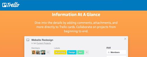
Trello helps you juggle multiple projects at once

As a freelancer, it’s not uncommon to work on more than one project at once. With tools such as Trello and Asana, you can keep track of everything in one place using boards, lists and cards.

Trello is a free online collaboration tool that allows you to add multiple users, all of whom can track changes in real-time. You can add images and files, set due dates and keep things organised and color-coded. There’s even a mobile companion app for when you’re on the go!

  1. Manage your money

manage money

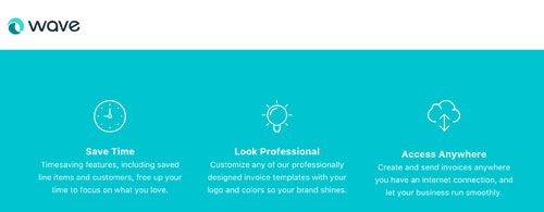
Wave apps are a (mostly) free way to manage your money

Keeping tabs on your money is another key part of running a successful freelancing business. Using tools such as Wave and Xero, you’ll be able to do just that.

And most of the Wave apps are free, including features to help with accounting, invoicing, and personal finance and tracking receipts. And if you need to add payroll and credit card payments, there’s a paid option for that.

  1. Value your time properly

value your time

This tracker shows you what’s eating up too much of your time

As a freelancer, time is just as important as money, so time trackers such as Toggl and Harvest are ideal.

Toggl is an online service that helps you manage and track your time. With a few simple clicks, you’ll be able to split your time between different projects and track exactly which tasks take the most time to complete. You’ll also be able to share professional-looking reports with your clients.

  1. Get the word out

get the word out

Set up a website to help people find you

You can have the best product or service on the planet, but if nobody knows about it, it’ll never sell. One of the best ways to advertise what you do is by having a website. With a website, people can find out what you offer, and more importantly, how to contact you.

WordPress is a great platform for this, and there are plenty of WordPress tutorials to help you get up and running. Alternatively, take look at out roundup of the best free blogging platforms and also consider setting up Facebook Pages for business.

  1. Connect with the community

connect community

A newsletter is a good way to connect with your community

Once you have your website up and running, it’s time to start a newsletter. With a service like MailChimp, you can easily create professional-looking newsletters that you’ll be able to plug in to your new WordPress site.

Newsletters are a great way to let your clients know what you’re working on next, as well as advertising any news or public appearances. Another way to get your news out there, perhaps on a more ad hoc basis, is to start a blog.

  1. Stay in sync

stay in sync

Sync your calendars and share your files with Google’s G Suite

Scheduling and document sharing between multiple clients and collaborators can be a headache for freelancers. But it’s easy when you use the suite of tools provided by Google’s G Suite. Not only can you use Google to keep track of your important calendar events and reminders, but you’ll be able to collaborate and share documents with your clients and other team members.

  1. Find new work

find new work

There are many services to help you find freelance gigs

When it feels like you’re rushed off your feet with current jobs, it can be hard to find the time to tout for new work. But if you don’t, you could end up with uncomfortably long gaps between paying gigs.

Although there’s a small monthly fee to use it, FlexJobs is one of the better sites for finding guaranteed, legitimate freelance work. With a variety of different job categories to explore, you’re likely to find something to match your needs. And because FlexJobs acts as an aggregator, you won’t need to spend hours online searching every corner of the web.

  1. Take time for yourself

take time


This app is sure to liven up your exercise break

Freelancers tend to work long hours, but it’s important to take frequent breaks in order to recharge your internal battery. For many, exercise is the first choice. However, just walking about gets boring.

If you’re looking to liven up your break time, have a look at Zombies, Run!, an exercise app that adds mild zombie threat to your exercise routine.


Necessary tips to manage a freelance design business

How to create better wireframes

wireframe

Wireframes are a necessary part of the web design process. Acting like blueprints for web and app projects, they help you discover early on what works and what doesn’t, and allow you to set the content and focus without the distraction of a flashy design.

When done well, wireframe can clarify your thinking. But they can also derail a project if not done correctly. With that in mind, below you’ll discover some straightforward ways to improve your wireframing skills.

Following these tips will help keep you focused on what’s important: ensuring the functionality and usability of your product

1.Start your wireframing with a sketch

While it may seem like a good idea to jump right into your favorite design tool, sketching out your wireframe – with a pencil and paper – can yield better results. The process shouldn’t take too long, and it’ll help give you a better idea of your overall plan.

2. Skip the color

The purpose of a wireframe is to lay out content, page and view elements, and to describe the app’s functionality. Adding in any elements of design, such as color, detracts from its primary purpose. So leave the color for the mockup, and keep it out of the wireframes.

3. Keep wireframes simple

Don’t overcomplicate your wireframes. Keeping it simple will allow you to focus on the bigger picture and avoid distractions. Wireframes should clearly describe the usability and functionality of your app. You don’t need to get into the nitty-gritty details or the final look of the design.

4. Use better sample data

Poorly selected sample data can kill a wireframe. While you don’t need to spend a lot of time populating your wireframes with data, you should at least make sure the data you add is relevant.

5. Annotate when needed

At their core, wireframes are blueprints; they are the designer’s and developer’s guide to building the app or website. If you want them to be easier to read and understand, add annotations when needed and where appropriate.

6.Use a grid system and lay out boxes

An interesting technique for making wireframes is to use a grid system and layout boxes. Using this approach, you can quickly group and lay out the different components in a simple and structured way.

7. Create reusable styles and symbols

Most software used for wireframing has the capability to create and reuse styles and symbols. Not only will this help to speed up the process, but it’ll help keep your wireframes consistent.

8.Know your wireframe types

If you’re unfamiliar with the term ‘fidelity’, it means the level of detail. In the world of wireframes, your options are low fidelity and high fidelity. Both are needed, but each has its own function and purpose.

A low fidelity wireframe is where it all starts. It’s the basic no frills, quick to create, wireframe. Its primary purpose is to get you started. Whereas high fidelity wireframes provide a lot more detail, though aren’t full-color mockups. Often these are grayscale or single color wireframes, which provide a closer representation of the actual design.

9. Get feedback early and often

One of the benefits of using wireframes is that they take very little time to create. As such, they can be shared with the team earlier in the design process. This makes it easier to catch things early on and address them accordingly. That said; get feedback on your wires early and often.

Wireframes shouldn’t slow you down. They are just one step in the process to creating better UX/UI designs for your users.

How to create better wireframes

Build a website prototype

Asking ‘What’s the best way to build a website prototype?’ is like asking ‘What’s the best way to make a website?’ There is no single ‘best’ way. Each individual prototype, like each individual website, has its own styles, objectives, and strategies.

In this article we’ll explore most common website prototyping methods.They are presentation software (mostly for beginners), coded prototypes (intermediate to advanced).

01. Prototyping with presentation software

For starters, there’s the traditional PowerPoint, a reliable business staple that has been used for presentations for over two decades.

Let’s take a look at the pros and cons so you can make an educated decision.

Pros of prototyping with presentation programs

  • Familiarity: You know the basics, and it’s not that hard to learn more advanced features. Features are like animations, slide transitions, and linking slides for interactions
  • Basic element libraries: Thanks to simple wire framing libraries, you can quickly create low-fidelity wireframes and then link them together for a clickable prototype
  • Natural linear flow: The slideshow nature of these tools takes you through a sequential user flow, which forces you to think about the experience aside from visuals. For more advanced users, you can link slides in complex ways that go outside the linear progression

Cons of prototyping with presentation programs

  • Limited scope: ebook The Ultimate Guide to Prototyping, once you start playing around with advanced user flows and interactions, you’ve basically hit the limit of presentation software
  • Limited collaboration: Most presentation software doesn’t offer any collaboration (except for Google Presentation). The trade-off is that collaborative presentation software lacks interactivity, graphics manipulation, shapes, text, and colour options that make them worthwhile for prototyping. If you want to collaborate without compromise, stick to a prototyping tool
  • Limited flow charting: Although it is possible to communicate advanced user flows, it’s not easy to do and sitemaps aren’t linked to the website prototype as they are in dedicated prototyping software
  • Limited interactivity: Resourceful users can get pretty far if they use all the features or PowerPoint, but if you’re going to go to all that effort, it might be easier and more effective to switch over to something specialized

02. Coded (HTML) prototyping

One of the biggest questions designers have about creating a website prototype is whether or not to use code. This uncertainty stems from some designers’ lack of comfort with coding: they either don’t know how to do it, or don’t like doing it. When compared with the more fun and intuitive method of using a prototyping tool or even sketching by hand, writing code can feel tedious.

Today there are more reasons than ever to start coding early. The ‘I design it, you build it’ waterfall mentality taken by designers in the past has become outdated as technology advances in large strides and collaboration becomes mandatory.

There are a few distinct advantages of prototyping in code. Mostly owing to the fact that you’re starting the design in something that resembles the final form.

Pros of coded prototyping

  • Platform-agnostic: HTML prototypes work on any operating system, and nobody needs outside software to use it
  • Modular: HTML is component-based, which can help with productivity
  • Low cost: There are many free HTML text editors. But you’ll need to spend some time learning the language before it’s helpful
  • Technical foundation: Provided you’re creating production-ready code (and not just throwaway for the sake of a quick prototype). You can end up saving time in development

There are variety ways to built a coded website prototype. But HTML is perhaps the most popular.  The real consideration in deciding whether or not to use code in your website prototype is your skill level. Not all designers have the ability to code, so don’t overextend yourself unless you’re technically confident.

Furthermore, diving straight into code may inhibit creativity. Ask yourself how many interactions and page flows you can create with 30 minutes in a prototyping tool versus a code like HTML or JavaScript.


Build a website prototype