How to create better wireframes

wireframe

Wireframes are a necessary part of the web design process. Acting like blueprints for web and app projects, they help you discover early on what works and what doesn’t, and allow you to set the content and focus without the distraction of a flashy design.

When done well, wireframe can clarify your thinking. But they can also derail a project if not done correctly. With that in mind, below you’ll discover some straightforward ways to improve your wireframing skills.

Following these tips will help keep you focused on what’s important: ensuring the functionality and usability of your product

1.Start your wireframing with a sketch

While it may seem like a good idea to jump right into your favorite design tool, sketching out your wireframe – with a pencil and paper – can yield better results. The process shouldn’t take too long, and it’ll help give you a better idea of your overall plan.

2. Skip the color

The purpose of a wireframe is to lay out content, page and view elements, and to describe the app’s functionality. Adding in any elements of design, such as color, detracts from its primary purpose. So leave the color for the mockup, and keep it out of the wireframes.

3. Keep wireframes simple

Don’t overcomplicate your wireframes. Keeping it simple will allow you to focus on the bigger picture and avoid distractions. Wireframes should clearly describe the usability and functionality of your app. You don’t need to get into the nitty-gritty details or the final look of the design.

4. Use better sample data

Poorly selected sample data can kill a wireframe. While you don’t need to spend a lot of time populating your wireframes with data, you should at least make sure the data you add is relevant.

5. Annotate when needed

At their core, wireframes are blueprints; they are the designer’s and developer’s guide to building the app or website. If you want them to be easier to read and understand, add annotations when needed and where appropriate.

6.Use a grid system and lay out boxes

An interesting technique for making wireframes is to use a grid system and layout boxes. Using this approach, you can quickly group and lay out the different components in a simple and structured way.

7. Create reusable styles and symbols

Most software used for wireframing has the capability to create and reuse styles and symbols. Not only will this help to speed up the process, but it’ll help keep your wireframes consistent.

8.Know your wireframe types

If you’re unfamiliar with the term ‘fidelity’, it means the level of detail. In the world of wireframes, your options are low fidelity and high fidelity. Both are needed, but each has its own function and purpose.

A low fidelity wireframe is where it all starts. It’s the basic no frills, quick to create, wireframe. Its primary purpose is to get you started. Whereas high fidelity wireframes provide a lot more detail, though aren’t full-color mockups. Often these are grayscale or single color wireframes, which provide a closer representation of the actual design.

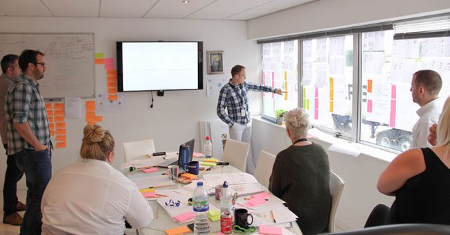
9. Get feedback early and often

One of the benefits of using wireframes is that they take very little time to create. As such, they can be shared with the team earlier in the design process. This makes it easier to catch things early on and address them accordingly. That said; get feedback on your wires early and often.

Wireframes shouldn’t slow you down. They are just one step in the process to creating better UX/UI designs for your users.

How to create better wireframes

Build a website prototype

Asking ‘What’s the best way to build a website prototype?’ is like asking ‘What’s the best way to make a website?’ There is no single ‘best’ way. Each individual prototype, like each individual website, has its own styles, objectives, and strategies.

In this article we’ll explore most common website prototyping methods.They are presentation software (mostly for beginners), coded prototypes (intermediate to advanced).

01. Prototyping with presentation software

For starters, there’s the traditional PowerPoint, a reliable business staple that has been used for presentations for over two decades.

Let’s take a look at the pros and cons so you can make an educated decision.

Pros of prototyping with presentation programs

  • Familiarity: You know the basics, and it’s not that hard to learn more advanced features. Features are like animations, slide transitions, and linking slides for interactions
  • Basic element libraries: Thanks to simple wire framing libraries, you can quickly create low-fidelity wireframes and then link them together for a clickable prototype
  • Natural linear flow: The slideshow nature of these tools takes you through a sequential user flow, which forces you to think about the experience aside from visuals. For more advanced users, you can link slides in complex ways that go outside the linear progression

Cons of prototyping with presentation programs

  • Limited scope: ebook The Ultimate Guide to Prototyping, once you start playing around with advanced user flows and interactions, you’ve basically hit the limit of presentation software
  • Limited collaboration: Most presentation software doesn’t offer any collaboration (except for Google Presentation). The trade-off is that collaborative presentation software lacks interactivity, graphics manipulation, shapes, text, and colour options that make them worthwhile for prototyping. If you want to collaborate without compromise, stick to a prototyping tool
  • Limited flow charting: Although it is possible to communicate advanced user flows, it’s not easy to do and sitemaps aren’t linked to the website prototype as they are in dedicated prototyping software
  • Limited interactivity: Resourceful users can get pretty far if they use all the features or PowerPoint, but if you’re going to go to all that effort, it might be easier and more effective to switch over to something specialized

02. Coded (HTML) prototyping

One of the biggest questions designers have about creating a website prototype is whether or not to use code. This uncertainty stems from some designers’ lack of comfort with coding: they either don’t know how to do it, or don’t like doing it. When compared with the more fun and intuitive method of using a prototyping tool or even sketching by hand, writing code can feel tedious.

Today there are more reasons than ever to start coding early. The ‘I design it, you build it’ waterfall mentality taken by designers in the past has become outdated as technology advances in large strides and collaboration becomes mandatory.

There are a few distinct advantages of prototyping in code. Mostly owing to the fact that you’re starting the design in something that resembles the final form.

Pros of coded prototyping

  • Platform-agnostic: HTML prototypes work on any operating system, and nobody needs outside software to use it
  • Modular: HTML is component-based, which can help with productivity
  • Low cost: There are many free HTML text editors. But you’ll need to spend some time learning the language before it’s helpful
  • Technical foundation: Provided you’re creating production-ready code (and not just throwaway for the sake of a quick prototype). You can end up saving time in development

There are variety ways to built a coded website prototype. But HTML is perhaps the most popular.  The real consideration in deciding whether or not to use code in your website prototype is your skill level. Not all designers have the ability to code, so don’t overextend yourself unless you’re technically confident.

Furthermore, diving straight into code may inhibit creativity. Ask yourself how many interactions and page flows you can create with 30 minutes in a prototyping tool versus a code like HTML or JavaScript.


Build a website prototype

Some tips for successful design sprints

What is a design sprint?

Product design sprints are invaluable for new businesses or existing companies looking to design a website or refine a digital product.

A sprint is an intensive week that aims to help the team understand of what the product is (or should be). During the sprint, the team brainstorms ideas and features, decides on which ones to explore, and then finally prototypes and tests these concepts with real users.

Sprints make it possible to learn what would traditionally take months of effort in just a single week, ensuring that valuable time and money should not be waste on something that might not work.

What do you need?

Before you start the design sprint, you’ll need to make sure that everything is prepared. You’ll need a room (ideally a large boardroom with lots of whiteboards) and supplies such as Sharpies, Post-Its, paper, Blu-Tac and stickers.

Next you need to make sure you have the right people in the room. From the client side you’ll need a product owner and a couple of stakeholders. You don’t want any more than five, but you do need to make sure that key decision-makers are included. Your internal team should probably consist of a UX expert, a tech expert and a facilitator who is able to steer the group.

With everything set up, you can kick off your sprint.

design sprint

How do you run a design sprint?


First you need to understand the problems you’re trying to solve, and identify your goal. Discuss ideas, analyses competitors and review analytics. Define what the client and the team want to focus on, and then you can begin on the main user journey.

Day 2: Diverge

Break up the overall user journey and start focusing on the little issues that can make a big difference, solving the problems you identified in day one. Everyone will have different solutions, so work individually, quickly creating sketches and notes with different ideas on. Don’t get hung up on one specific idea – the key here is to get as many different options on the table as possible.

Day 3: Make a decision

This is perhaps the most important and difficult day. It’s now time to make some decisions on how the prototype will look. With lots of ideas in front of you, you need to review, critique and choose which elements to take to the next stage.

whole team vote for the best options by using stickers to identify the group’s favourite features and a overall design. Then, construct a new storyboard with the agreed concepts and UI interfaces to act as a blueprint for the following day.

Day 4: Prototype

With a storyboard agreed upon, the UX designer gets to work on creating a working prototype for user testing. There are just a few hours to work. So at this point the prototype is not meant to look pretty, be branded or function perfectly.

A rough mock-up means you can maximize time and get the most important parts of the design for users to review. And without wasting effort on something that could end up getting scrapped.

Day 5: Test and review

It’s crunch time – now you turn the prototype over to real users to get their feedback. We have a test rig that allows us to record the tests and share them with all the stakeholders. So they can see what real customers think of the product, and watch how they interact with it. The validation or critique these users provide is insightful and invaluable.

 Why is it beneficial?

The whole process is fast and efficient, which means resources aren’t wasted. With everyone involved in the sprint, from our own UX team to the CEO of the client’s company, we know everyone is aware of what’s going on and has had the chance to share their own opinions and ideas.


There are no bad outcomes with a design sprint. Within just five days, we have a working prototype with real user feedback. We can get criticism and constructive feedback from the users, without having to go through a lengthy product launch. This process we use successfully with a number of our clients and we recommend you try them too.

Some tips for successful design sprints

9 steps to build perfect website layout

When designing a website layout there are some common mistakes that often pop up, especially with interns and new designers. In this list DevsZone provides 9 steps to build  perfect website layout, we cover what every new website builder working within a digital agency should know and do before starting a new project, and what they should pay attention to during the process to avoid making these mistakes.

website layout

DevsZone provides 9 steps to build perfect website layout

1.Define what success means

Before starting the work you need to know what is it you are designing for. Besides the description of the site, you need to know what the expectations are for it. Take a news site for example, what’s the goal? Is it to make make as many ad impressions as possible or is it to provide the best reading experience? How are those goals going to be measured?

02. Put your thoughts on paper first

This seems very obvious but I’ve found too often that designers jump straight into their work before giving any thought to the problem they are trying to solve. Design is about solving problems, and those problems can’t be resolved through gradients or shadows but rather through a good layout and a clear hierarchy.

Think about the content, the layout and the functionality before starting to drop shadows. Make sure those thoughts are in line with your client’s goals and feel free to share them. No client ever has complained to me about over-communicating ideas.

03. Start sketching a top-level framework

When I’m asked to create a look and feel for a project, the first thing I do is to come up with a top-level framework that solves all the design problems. The framework is the UI that surrounds the content and helps the user perform actions and navigate through it. It includes the navigation and components like sidebars and bottom bars.

If you approach your design from this perspective, you will have a clear understanding of what your layout needs will be when designing sections beyond the homepage.

04. Add a grid

It’s as simple as it sounds. Before starting to design anything you need a proper grid. There are no valid excuses for starting without a grid – and if you don’t, I can assure you, the design won’t look as good. A grid will help you to structure the layout of the different sections; it will guide you through the specific screen size requirements, and help you to create responsive templates, so you’re consistent in terms of spacing as well as many other design issues.

05. Select your colour theme

During the process of choosing a set of typefaces, you should start exploring what colours you will use in the UI, backgrounds and text. I recommend using a limited set of colours and tones for the general user interface.

It’s important to apply those consistently across the UI depending on the element’s functionality. Think about the layout of sites like Facebook, Twitter, Quora and Vimeo. Besides the UI there shouldn’t be any colour restriction for illustrations or graphic details, as long as they don’t interfere with the functionality of the components.

06. Divide the layout

The simpler the structure of the site, the easier it is for users to navigate. Each section in your site needs to tell a story; it needs a reason and a final outcome for the user. The layout should help the content to highlight what are the most important pieces in that story.

07. Think in motion

Motion is essential when designing interactive experiences. No design can be judged on its own or as a static comp any more; every component is defined by its relationship with the system, and that relationship needs motion to be conveyed properly.

Motion can illustrate dynamic effects on content or interactive states within your layout. For that second purpose I recommend taking your designs a bit further into prototyping.

08. Challenge yourself

I encourage every designer out there to challenge themselves on every project. Innovation isn’t always a requirement for the project, so it’s up to us to come up with something fresh. Examples of different challenges could include using a new grid system, creating a new component, or even minor challenges like avoiding blend modes or using a specific colour.

09. Pay attention to the details

This statement has been overused lately but it’s not always visible in the final product. Depending on the concept behind the project, that ‘attention to detail’ can mean different things.

It could be a small interaction, an unexpected animation or an aesthetic touch like a little gradient in a button or a subtle stroke around a box in the background. But overall this touch is essential – and it will come naturally if you really enjoy what you do.


Your pages become attractive if we use the right tools. They can display correctly in the browser and your visitors would be glad to visit again because you appealed to then.

Here these 9 steps to build  perfect website layout helps you to develop your desired site.

9 steps to build perfect website layout

Some tips to write a CSS

DevsZone gives you some tips to write a CSS that is clean, efficient and useful.

Writing better CSS doesn’t have to be a painstaking ordeal. A few minor adjustments to how you work within your CSS code file can have a big impact. In this article, we’ll take a look at some tips to write a CSS that you  can improve your CSS skills and write cleaner, more efficient, and better CSS code.

1.     Start with a CSS Reset

CSS Reset

CSS Reset gives you a clean base to work.

CSS Reset allows you to start with a clean base, making it easier to style your website, with more predictable outcomes across the board.

A CSS Reset resets or overrides the default styles of the browser. You may write your own, use one of the many resets available online, or use a combination of the two.

2.     Know when to use CSS shorthand

css shorthand

DevsZone gives you a way is Shorthand should reduce your file size and help speed up load times

CSS shorthand enables you to set multiple properties of an element in a single line. Using shorthand saves space and takes less time to load. However, you shouldn’t use it for everything.

Sometimes longhand provides much-needed clarity. But more importantly, when you only need to set one or two properties – or you simply need to override something – longhand may actually be better.

3.     Keep it DRY

Dry css

Quite possibly the best advice for writing better CSS code is to follow the DRY methodology. DRY means ‘don’t repeat yourself’ – essentially, don’t use the same bits of code over and over again.

One way to keep things DRY in CSS is to group things together. Let’s look at an example.

Original CSS

.menu li {

color: red;

}

.menu li a {

color: red;

}

Refactored and DRY

.main li, .main li a {

color: red;

}

As you can see, not only will this reduce the overall size of your CSS file – which creates faster load times – but you’ll also benefit in the area of maintenance too. If the color property needs updating, you’re only updating it one spot.

You can also use CSS custom properties to help stay DRY. Custom properties are created like so:

:root {  –primary-color: red;}

And then can be used anywhere within your CSS code, as often as you’d like:

.main li, .main li a {  color: var(–primary-color);}

05. Keep consistent

Regardless of how you write your CSS, and in which order you add the properties, keep it consistent. Some people order their properties alphabetically, while others use more of a logical approach – for example, organising things by line length or type. I opt for the former, but it’s entirely up to you. The bottom line is whatever you choose, stick with it so it’s easy to find things later.

06. Name things intelligently

name things

Use a standard naming convention for your selectors

This seems like a no-brainer, but when naming your selectors, don’t get overly complicated. Be succinct and stick with a standard naming convention.

Some things to consider when coming up with your selector names:

  • Avoid presentation words: These are the ones that involve colour and display location (for example, green-text or top-menu-bar)
  • Only use lowercase: CSS is case-sensitive, so don’t create names like, MeNuBaR. It should be noted, however, that camel case (menuBar) is an acceptable practice, just not preferred in some cases
  • Separate multiple words using a dash: For example, main-menu. You may also use camel case (mainMenu), but again, this is often not preferred
  • Don’t be too specific: You’ll end up using multiple selectors for the same type of element. For instance, list-one and list-two can be combined, creating a single list-items

DevsZone rounded up some tips to write a  CSS for designer. These are helps you a to create a design.

Our main target is our client’s satisfaction to provide best web design or development.


Some tips to write a CSS

Some tips to write a CSS

Free UI kits for web designers

Free UI kits for web designers provide a set of resources you can use to develop the user interface of your application, whether you’re working in Photoshop or CSS with developer tools on the web. A UI kit is so termed because it brings together several different parts of the user interface for designer, including widgets and buttons, layout, typographical settings and often user interactions or feedback modules.

‏On the web a UI typically comes as a CSS library with a collection of fonts and images, and sometimes a small JavaScript library to provide a polyfill for any advanced functionality not supported in older web browsers.

There are so many great examples of UI design on the web that some may think it’s easy to create an attractive, easy to use interface.

Here we’ve rounded up some CSS-based UI kits that make developing a pleasant and usable website layout quick and easy. Check them out,

01.Get Shit Done

Get Shit Done

This is free UI Kit called Get Shit Done. It makes for great customization over Bootstrap and is very easy to use. The website itself is easy to navigate, so you’ll find just what you need in a matter of seconds.

02. uikit

uikit

The simply-named uikit is a lightweight modular framework. As with all the kits we’re featuring here, the framework includes lots of handy components including navigation bars, buttons, tooltips and modals. There’s also a solid grid system underpinning the layout. You’ll find a series of pre-set themes, but also a customizer tool that’s akin to jQuery UI’s theme editor.

03. Brick

Brick

Brick has been developed by Mozilla, and includes a range of user interface components designed with the modern web app in mind. Underpinning the wide range of plug-and-play elements is a robust cross-platform framework that is code-light and interestingly, for the standards-lovers, makes use of Web Components: an upcoming W3C specification for defining new DOM elements in an HTML document.

04. MetroStyle Web UI

metrostyle

As you may have guessed from the name of this kit. MetroStyle replicates the design aesthetic of Microsoft’s Windows reboot, and applies it to the web in this simple. But functional set of widgets, grids and styles. It’s a clean (if conservative) option if you’re looking for a system that’s easy to pick up.

05. INK v2

ink

Ink provides a focus on responsive layout and design, incorporating a set of useful elements that automatically reformat to fit the user’s screen size.You don’t need to deal with any of the mechanics yourself.

06. Stella Blogging UI Kit

Stella Blogging UI Kit

As with all the kits we’re featuring here, the kits includes lots of navigation bars, buttons.

07. Facebook Analytics UI Pack

Facebook Analytics UI Pack

Here all are free UI kits for web designer. You just check out and pick your desired kit for your user interface.

Free UI kits for web designers helps you to create an expected web design for your client.

Free UI kits for web designers


Free UI kits for web designers