Common Mistakes That Beginner Designers Make

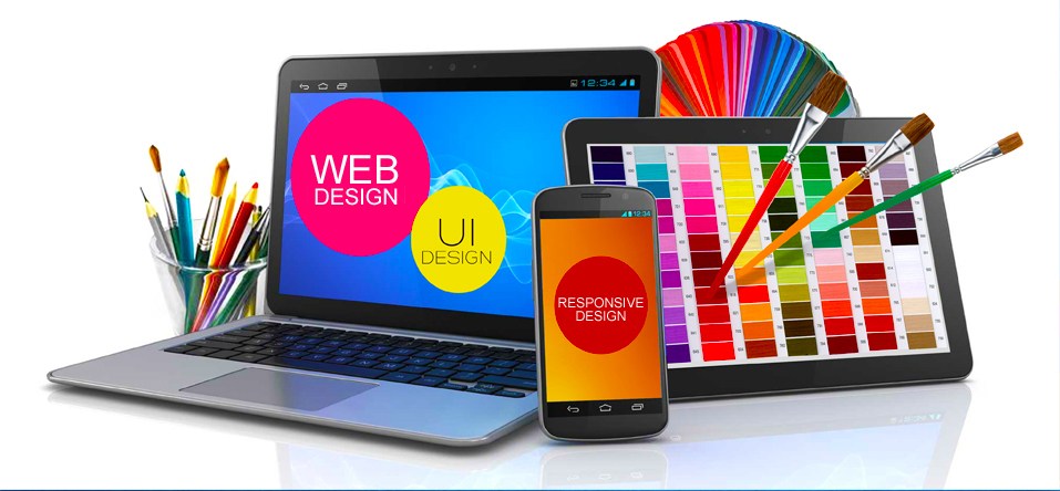
Beginner web designers and developers frequently look at their creations and say things like “this kind of stinks, but I don’t know why!” or “this looks like the zombified version of a good design…”. Even if you have read a design theory book or two, it can be tough to create an entire seamless design at first. Heck, it can even be tough to create even one coherent section of a seamless design.

You can use a more scientific approach to working out what is going wrong with your design. Although you may feel that your design is so bad that it is beyond saving, it may only be a few lines of CSS or a couple of tweaks away from becoming respectable. This post outlines eight things that commonly go wrong, and eight little web design tips  that will magically help to improve your design.

web design tips

The first version of Facebook. Looks like they could use some design help.

  1. Font-Weight

Thin fonts are very popular in 2016. But they do carry one major risk – eye strain. Eye strain occurs when the user has a hard time reading the content on your site, so the user must focus further to read it. This will exhaust the user, and make them want to leave your site. It will also force them to devote their energy to reading the text, as opposed to thinking about what it is saying. Since thin fonts can be hard to distinguish, they may increase eye strain for your user.

web design tips

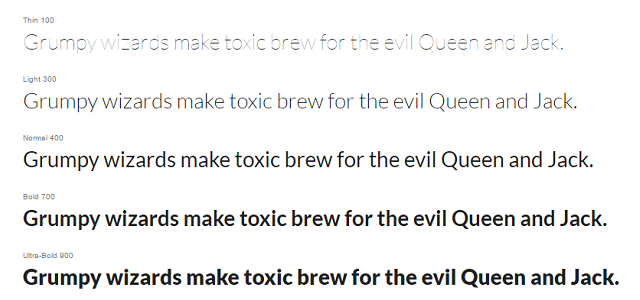
Check out this example from Google Fonts. Lato font with a font-weight of 100 is incredibly difficult to read, even with the color contrast of black text on a white background. On the other end of the spectrum, with a font-weight of 900 is also a challenge to read. The bolder letters make it difficult to distinguish their differences.

For a body font, i.e. one that you expect people to read more than one bullet point at a time, you will want to use a font-weight of around 400. This will create the least amount of eye-strain. Here is where the challenge comes in – if a user looks at your design, they will likely not say “your font-weight is wrong.” They will probably say, “this is hard to read.” It is up to you to interpret that as, “I need to check the font-weight!”.

  1. Color Contrast

Users usually scan websites on their first visit. This is because it is challenging to read every point, and your user would like to quickly work out if the site will solve their problems or not. Let’s say you are designing an interface like a landing page, and you would like users to find the button they need to click to go to the next page, color contrast is an excellent way to help the user quickly discover the right button, and pick it out from other options on the page.

web design tips

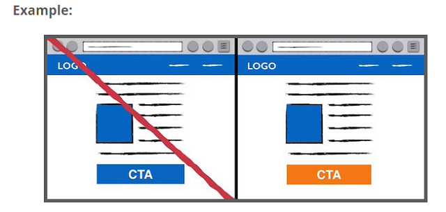
You can clearly see that the orange-colored button stands out. This makes the user’s life much easier. The suggested next step jumps off the page!

  1. Use of Icons

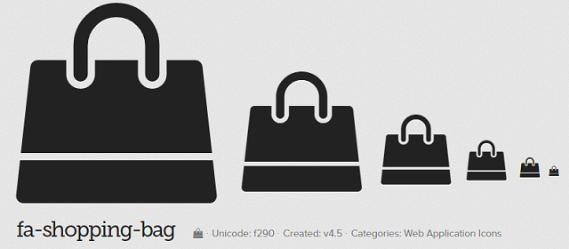
Why do resources like Font Awesome exist? Can’t people just read the darn text without a cute little icon? Well yes, they could. But, a text-only interface makes the user’s life much more challenging. If they need to read the text and wonder if it means what they think it means, that is far too much effort to ask from a user. If you add an icon to your text, it adds a little more clarification for what the text means.

web design tips

This is Font Awesome’s Shopping Bag” icon. Now imagine this next to the text “Checkout” in an eCommerce site. The user will know exactly what will happen next, and that is what you want. They know it will lead to a familiar checkout process.

web design tips

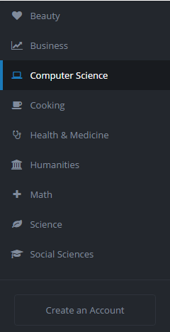
Here is an example from TheNewBoston.com. The icons make it clear that these are navigation options, and not something else. They fulfill a common pattern and let you know that they are clickable. Their “Create an Account” button could use a little more color, though!

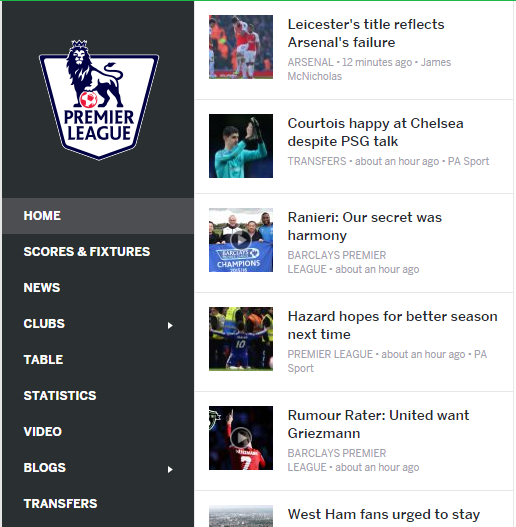
  1. Clear Headers and Body Text

When you need to explain what your site does, the content can get long-winded. If a user is on your site for the first time, they may not want to read too much to get the point. This is why you should have 3-7 word headers over any full sentence or explanation. These are perfect for scanning. The user can jump around the page, read the header, and quickly decide if they want to read the paragraph to learn more.

web design tips

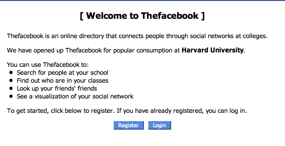
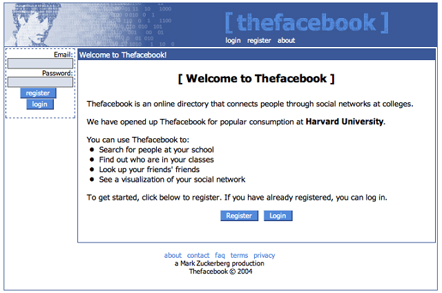
Here is an example from the first version of Facebook. This is not user-friendly. The first header, “[Welcome to Thefacebook]”, should instead quickly describe what the site does. The next two sentences are slightly unrelated and just sit there. They could use a Harvard logo to make it easier to read! The bullets are the one good part of the design since those are easy to understand. But they are in the middle of a bunch of vaguely-related statements.

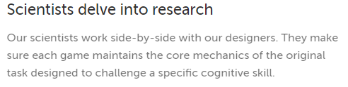
Lumosity.com does a great job with this. They have a brief summary header that’s followed by an explanation. Since they have many products to explain, there are a bunch of similar sections on their site. This makes the user’s job so much easier because they can bounce around the page. The header and body are well-distinguished with font-size and color. The line-height on the paragraph makes it easy to read.

  1. Make Clickable Elements Obvious

If you want somebody to complete an action, you need to make it clear that an element is clickable! Common clickable items on sites include links, buttons and menu items. Links usually have a blue color, and some sort of underline. Buttons have a significant color contrast to the rest of the page, and may also change their CSS on hover or on click. Menu items may have an icon next to them, and likely highlight when the user hovers over them. These are common constructs that the user expects.

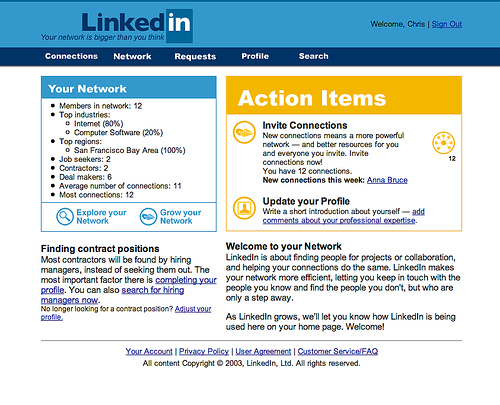
Above is an early version of LinkedIn. There are many prominent links on the site, but what about buttons or menu items? The top line could be menu items, but only “Profile” and “Search” give the user a clear idea on where these menu items will take them. If the functionality of the buttons is instead included in links, the user needs to read those entire paragraphs to work out what they can do! This makes it hard to figure out how the site might benefit the user.

  1. Colors That Agree

The human brain desires colors that bring further clarity and order to a site. If you have too many similar colors, the user will need to strain to distinguish between them. Extra strain will make the user’s brain work harder. If you have too many colors that clash with each other, the user’s brain will be overwhelmed by trying to decipher all the different meanings. So, you need color balance. Easier said than done.

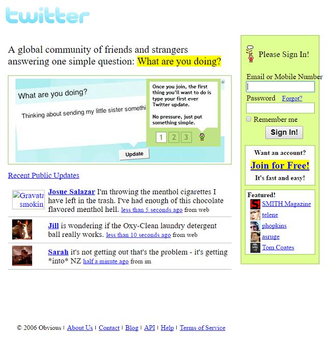
Above is an early version of Twitter. The color that is out of place is immediately apparent – the green background in the signup form. This quickly draws the user’s attention, and prevent them from actually reading the part of the page that explains the site.

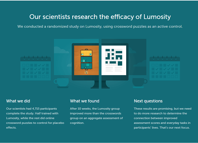
Lumosity does a great job with color. They have white, orange, and teal in this particular sections, and they flow smoothly.

  1. Information Consistency

Each time you present a piece of content, it should have the same layout. If you are trying to explain to a user how many connections they have on the site, then the connections content should have a similar format, color, and proximity to related pieces of information. Also, pieces of content that are different but fulfill a similar role on the site should stay consistent. For example, every time you have instructions, they should be oriented on the same part of the page, with the same font and same size.

ESPN has a very consistent structure throughout their pages, across all sports. The menu is on the far left, the list of news stories is adjacent to that, and the stories themselves are presented as an infinite scroll in the middle. This means that as you choose between leagues, teams, and sports, you know exactly where to find the relevant info.
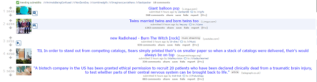
  1. Alignment

If you want your user to read as much information as possible on your page, you want to make each piece of information as digestible as possible. This is where alignment comes into play. Alignment, usually either left or center-aligned, determines where the user’s eye should begin. Here are two versions of Reddit, one left-aligned and one center-aligned.

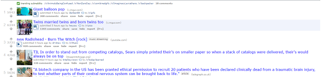
Scanning the variety of links is a huge part of Reddit. In the first example, the real Reddit site, the user’s eye immediately starts at the point where the image meets the link title. They can then quickly scroll down the page and read all the titles and pictures to determine which are worth checking out.

The center-aligned version creates much more stress for the user. The image seems unrelated to the content of the post, and as the user attempts to scan down the page, their eye must bounce around to the beginning of each link title. This small amount of stress adds up quickly. Now imagine that the user is browsing a bunch of pages on your site and needs to understand the design of each page quickly, you will want to make it as easy as possible to move through the content.

Conclusion

When you break your code, you will get an error message, or your output will be clearly wrong. But with design, fixes can be much less clear. If you think about these methods, you will at least have a process to follow when strange design problems pop up. If you go through this process with a few of your site designs. It will quickly become embedded in your brain and an automatic part of your building process!


Common Mistakes That Beginner Designers Make

Check These Things Before Website Launching

Website launching is a stressful, complicated task, no matter your experience level. After all, any number of things could go wrong. ranging from the small (a misspelled word or broken links) to the large (forgetting to set up proper site redirects).

  1. Website Copy

It is important to have everything written and proofread before launching. Quite often, mistakes in copy, no matter how minor, will take away the credibility of the entire website. This is particularly true if you are offering your services on your website.

Another thing you need to make sure of before launching is to avoid publishing pages without actual content, never write “coming soon” or something similar. Do not launch if you don’t have the content for important pages like About Us, FAQ, and the like.

  1. Contact Details

If your website involves selling a product or your services, it is crucial to have your contact details visible on the site. Phone number, email address, and mailing address. Without this, your website’s credibility might take a dive.

If you are located outside of the US and you must use a 1-800 number, you can use VOIP services like Skype for a US number that you can use.

Launching a website

  1. Meta Description

Meta descriptions do not play a significant role in SEO, but they are what people see on search results. And if people don’t like what they’re seeing on the search results, they most likely will not click. So, be sure to optimize your site to include a descriptive but brief title and description.

  1. Site Security

Every day there are thousands of websites that are being hacked, and it doesn’t matter if the targeted website is a high-volume website or a new one. Personal and financial information can still be at risk. If you are not a web developer by trade, be sure to have an expert check your website’s source code for potential security flaws. If you are one, be sure to check the latest hacks, cracks, SQL injections, and XSS vulnerabilities.

Who use a WordPress website, I highly recommend installing WordFence Security. It will notify you about the changes in your website, it will block unwarranted logins, notify you of the things you need to update, and other important security details.

  1. Legal Pages

I’m talking about pages like Terms and Conditions, Terms of Use, Terms of Service, Refund Policy, and Privacy Policy, whichever applies to you. These pages are important in order for you to cover the legalities involved in people using your website, from copyrights, use of cookies, and information about your company. If you are using WordPress, you can install a plugin called Auto Terms of Service and Privacy Policy.

  1. JavaScript Independence

JavaScript brings a lot of client-side functionality to every website, and it’s lightweight too. But not every browser is created equal, and some have their JavaScript turned off for whatever reason, important or they just don’t know how to turn it on (after mysteriously turning it off). If you do not ensure JavaScript independence, your website may look like it’s broken or incomplete to other visitors.

Try turning off your browser’s JavaScript and browse around your website. If it looks broken, then you need to fix that.

  1. Backup

Your web host will most likely keep a backup of your website, but don’t put too much faith in them. Most web hosts are not good at keeping backups, unless you are paying them hundreds to thousands of dollars every month. Set a cron job for nightly or weekly backup, depending on your needs, and have the backups saved on a different location independent from your host.

If you are using WordPress, you can install a plugin called Dropbox Backup which will download all of your database and save it to your Dropbox account automatically at your own set intervals.

  1. Cross-Platform Compatibility

A newbie mistake is to not check your website across several devices and different screens. It doesn’t mean your website looks good on your browser (however you resize it) it will look good on every device’s screen.


  1. CRM Integration

If the purpose of your website is to capture leads, be sure to choose a CRM that you can integrate well with your website. This is to make things smoother and automatic. For example, you can use Mailchimp and HubSpot CRM to automate your sending and labeling of your subscribers. When someone subscribes to your mailing list, your CRM’s automation will kick in and will email them. When someone replies, AKA a hot lead, your CRM will place that person on high priority and proceed with whatever automation you’ve set.

A lot of websites don’t do this. And they are missing out on a lot of leads.

  1. Defensive Design

Once in a while a hiccup in your website will occur and people will land on non-existent pages. Sometimes they even land on pages that they shouldn’t have access to. Be sure to check every possible security risk in your website and block public access to those, and of course, when you block people on specific pages, you need to tell them why. In this case, a beautiful 404 page will do to tell rowdy visitors that they shouldn’t be there, or that the page does not actually exist.


  1. SEO

Great content is good, but if you are aiming to rank your site higher on search engines, be sure to keep in mind SEO as well. Do your research on the keywords you will use on your website’s headlines and body, as well as your meta keywords and descriptions.

  1. Validation

Your SEO will not matter much if your website fails on standard HTML and CSS validation. This is important because this is how web crawlers read your website. If it fails in that, search engines will most likely set your website to low priority and you can say goodbye to your dream of ranking your site high on search engines, especially Google.

  1. Secure Certificate

If your website accepts payments or other vital information from your users, be sure to use SSL protection for your website. Even though regular users don’t understand the technicalities behind it, they still understand that SSL or https is more secure, and that your site can be trusted.

  1. Analytics

I’ve seen many developers and designers launch their and their clients’ websites without adding analytics to it. How can you measure the effectiveness of your website if you don’t have an idea how many people are visiting it? This is a very basic mistake, so basic that people just tend to not put much thought into it. So, yeah, be sure to install one!

  1. Favicon

Don’t let people think that your website is broken. While a favicon doesn’t serve any purpose at all, except for the fact that it identifies your tab on browsers, it still pays a lot to have one ready. A blank favicon on your tab (yes, it’s that tiny icon on your tab next to your site’s name) will make people think that your website is somewhat incomplete, which it actually is.

Conclusion

These are the best ways to make sure the launch of your or your client’s site goes smoothly. Of course you will find, even after following these steps, that tweaks will be needed along the way – that is a fact of life in the world of development!


Check These Things Before Website Launching

Three More Tips for Your Website Design

 We have covered website design ideas in the past. But when competing with the countless other sites out there, one can never read too many tips and hints on how improve your site. So as to lower bounce rate, increase conversions and entice visitors to come back again.

One thing that must always be kept in mind when designing or maintaining a website design is composition. Composition is essentially how you have chosen to arrange all the elements of a web page. How these elements interact with each other and where and what any possible contrasts are.

Here then are three tips on how to optimize your site composition:


website design

Color

Color is naturally essential to any web page. Whatever colors you choose to have on your
website, they should leave a strong impression upon site visitors in one way or another. There is no hard and fast rule. But generally speaking, bright colors tend to denote energy and strong emotion, while darker and subdued shades create a calmer, contemplative tone.
Selective use of color can be utilized to attract a visitor’s attention to a certain part of your page, most usefully a CTA (Call to Action) like ‘Subscribe Here.’
Picking the right pallet is an intricate business. It is worth taking your time and gathering
feedback before going ‘live.

Prime Real Estate on Screen

It is important to understand where the majority of people look first and for longest on their screen. Perhaps conversely to what you may believe, this is not completely random. Most people spend the longest time looking up in the top left hand corner, and the least time in the bottom right– this has become a natural reflex, as opposed to people purely being guided by the design of a site to look in certain places. By gathering a comprehensive impression of where people’s focus should be, you can locate the highest-value real estate of your web page.

Negative Space

A tidy room fosters a tidy mind, they say. The same goes for web pages. Ensure that on every page of your site there is enough white space, sometimes referred to as ‘negative space.’ People will be quickly turned off by cluttered pages. Do not fill every pixel of the screen with pictures, widgets and text. Instead prioritize the most important aspects and allow them space to stand out and be counted. Essentially, negative space is only ever a positive.

Three More Tips for Your Website Design

How to Make Sure Your Site is Up-to-Date

Creating and launching a website is a great deal. However, if you think that once you launch a website, you’re done, you’re likely to miss quite a lot. A website requires constant care and regular updates.

website update

Why website update is important?

There are several quite important factors why you should consider regular investments to your online presence. These factors are:

  • Your rank by search engines. I bet you want to see your website on the first page of search results. Search engines “love” websites that are frequently updated as they consider that such websites provide more relevant and up-to-date content to the users. Moreover, over the time some links on your website may become a subject to link rot. If you don’t fix broken links regularly, search engines notice this and rate you lower.
  • How people perceive your website. If people land on your website and see that the latest blog posts there date two years back, they are likely to think that your business is not active or even ceased to exist. Consequently, they would opt for your competitors that are more active on the web.
  • Amount of interlinking. If you regularly post new informative and unique content, you’re likely to see people sharing it in social networks and linking to it on their websites. This is great for you in terms of SEO. However, if your great contents were created a couple of years ago, the rate if interlinking falls dramatically.
What are the three main vectors of website update?

I hope you’re pretty much persuaded that updating your website is important. But how to approach it? Actually, there are three main types of website maintenance that you should regard. Let’s briefly review them, before we go into detail:

  • Technical maintenance. No website is perfect, and over time your website is likely to encounter such issues as broken links, 404 Errors or missing media content. You need to regularly check for the appearance of such issues and fix them in order for your website not to lose its ranking by search engines.
  • Updating your website content. For a high-ranking website, a lively, regularly updated blog section is a must. Moreover, you need to update other sections of your website, such contact details, testimonials, home page, etc.
  • Keeping your website design up-to-date. Your great content won’t win over the hearts of your website guests if it’s presented on an outdated website that looks like a ghost from the past. Design accounts for the initial impression that your guests get on your website, as well as for their desire to keep coming back to it.

Some Tips to Follow to Keep Your Website Regularly Updated

Below, you’ll find some most useful tips to keep website update. These tips account for all three vectors of website maintenance, so you won’t miss a thing if you follow them. Let’s see what we”ve got here.

1) Eliminate Appearance of Broken Links

website update

Broken links make it impossible to access some pages on your website and result in site guests” disappointment. Websites with broken links are downplayed by search engines so that fewer people stumble upon broken links.

It’s okay that links get broken: some resources may be relocated, some pages may be archived or removed. It’s not okay if you don’t check for broken links and don’t fix them.

To detect and fix broken links you can turn to online tools, such as, Online Broken Link Checker and other tools. Moreover, if you run a CMS or e-commerce website, you may use a plugin or extension that checks for broken links.

2) Regularly Update Your Website Engine and Plugins

Keeping the software on your website up-to-date is a worthy concern. If you run a website with the help of a CMS (Content Management System) or an E-commerce engine. So you need to update the engine once the newer version of it is released.

Why update your website engine?

Regular engine updates are necessary from a security standpoint. Not updating your website regularly makes your website vulnerable to hacker attacks, which is definitely not what you desire. Moreover, website engines develop and a newer version may have the functionality you always wished to have.

When updating your website, you should do it with caution. You should always create a full website backup before updating your website. So that you can always revert your website to the previous state in case something goes wrong.

Update not only the engine but also website plugins. With newer plugin versions, you’ll have more functionality and features that you need.

3) Have a Frequently Updated Blog

First of all, it must be said that your website does need a blog section. Even if you run an e-commerce website, you need a blog section to make your website more engaging and to improve your position in search engine search results.

Once you have your blog, you need to update it frequently. Add new posts a couple of times every week, or at least just once a week, and both people and search engines will see that your website is alive and thriving.


4) Make Sure Your Contact and Personal Information Is Up-To-Date

Your clients should always be able to reach you out. This is a rule of the thumb. As time passes, some of your contact details may change. Keep in mind that in this case, you need to update information on your website as soon as possible.

This also refers to your operating hours. Is there a holiday coming soon? Don’t forget to notify your clients that you’re having a day off, so they know this and don’t get upset that they can’t reach you out.

Also, mind updating the sections, such as “About Us” and “Team”, once you have something to add or to change there.

5) Post New Testimonials

Don’t be lazy to share great things that people say about you. Fresh testimonials are definitely not a thing you should forget about. As soon as you have one or a couple, present them to the public and people will trust you more.

6) Be Active In Social Networks

website update

All modern businesses rely heavily on the presence in social networks. If your website isn’t tied to your accounts in social networks, such as Facebook, Instagram or Twitter, it’s rather a pretty disappointing neglect that should be accounted for.

Once you connect your website to your social media profiles, you should keep/start regularly sharing some small updates there. Having a corporate party, or just a morning cup of coffee with some interesting person? Share these moments and give your followers an insight into your daily life.


7) Watch Out For Outdated Imagery

Imagery is an important component of every website page. Once site guests land on a page, they esteem its design and imagery, and just then decide whether content is worth reading or not.

So, come back to your old posts from time to time and substitute obsolete imagery with the state-of-art one. This year, forget about poised, unnatural stock imagery and go for authentic photography that presents real people in real situations. Such imagery is proven to appeal more to emotions of your site guests and bring you more conversions.

8) Monitor Analytics and Run Usability Testing

When you monitor your website analytics, look for the pages that have the highest bounce rate. What’s wrong there? Think of how you can restructure, redesign or update the content of these pages. So that they are as captivating as your other website pages.

As the number of your website contents grows over time, you need to test, whether it’s still convenient for your website guests to navigate and use your website. Running usability testing is recommended once or twice a year. Don’t neglect this practice, as the convenience of your clients should be one of your paramount concerns.


How to Make Sure Your Site is Up-to-Date

6 things to watch out for in UX designer

The world of UX design is fast-paced and always changing. It can be overwhelming to keep up with what is coming next. So we’ve rounded up a few things to keep in your mind.

  1. Don’t get swept up by the next big thing

Design trends will always be part of the design landscape. And now – thanks to social media – the more successful ones will spread like wildfire across the world (ahem, flat design). It can be all too easy for us designers to jump on these trends. And dedicate our energies to them, but as more and more trends emerge. It’s up to us to think critically about each design trend. And see whether it actually is something worth spending time on.

  1. It’s all about software that aids collaboration

We are no longer in the age of the solo designer. Heroically working in Photoshop creating pixel-perfect designs that get thrown over the wall to development teams. UX designers need to embrace the plethora of UX tools available to us now that help bridge the gap between design and development.

  1. People are coming for your jobs. Skill up!

There are so many hungry  UX designers out there.They have traditionally thought of themselves as web, graphic or UI designers, that are now getting skilled up and educated about UX design. These designers bring tons of skills from other disciplines and are becoming real hybrid designers. So, traditional ‘pure’ UX designer might need to think about skill up in other areas to remain competitive.

  1. Thinking about more than just the visual

As technology progresses, we are being called upon to consider experiences that are more than just visual. Where you are looking, what you are hearing, how you are touching. All of these are becoming increasingly important for UX designer to think about. It’s not just what our users are seeing on a screen. It’s really important we keep knowledge about the possibilities of technology. And think about how we can design full experiences for all the senses.

  1. The next evolution of the wireframe

Wireframes are traditionally a staple deliverable of UX designer. But how can we level wireframes up to cope with the expectations of today’s design climate, where motion, gestures and interactivity rule? What is the next evolution of the wireframe and how can it best support our teams? Expect to see some exciting iterations pushing the boundaries of what we think a wireframe is.

  1. Creative facilitation is the key

A growing skill area for UX designer is the ability to creatively facilitate workshops, design sprints and meetings. The aim it to be an effective catalyst to propel teams to ideas, decisions and outcomes that are steps ahead of the pack. Leading teams through games, activities and discussions is a crucial job responsibility that more and more companies are jumping on.


6 things to watch out for in UX designer

6 skills for young web developer

This expert advice for web developer will help give you that competitive edge.

web developer

While it can be difficult to develop hard skills from scratch. It’s certainly not as difficult to hone your skills (including those softer skills) competitive edge. Learning can take many different forms, so what can the web developers of tomorrow do to get ahead?

Six expert authors and web developer what they think graduates and young web developer can do to give themselves a headstart. Here’s what they had to say:

  1. Specialize, don’t diversify

Harold Dost, principal consultant at Raastech suggests that young developers take some time to look at tools such as Lynda or Linux Academy. He stresses that tools such as these can be used to develop a strong foundation of knowledge on a key topics and can help you on your journey in becoming an expert.

“Hone a core skill (maybe two or three), and then diversify on the rest,” Dost says. “This will allow you to specialize and give you the in-depth knowledge which will be necessary as you go further in your career.”

But he also says that although you should specialize in a few areas, be careful not to neglect other opportunities. “At the same time as specializing,” Dost says, “be sure to keep learning about new technologies to allow you to grow and improve the work you produce.”

  1. Read and write (and write more than just code)

Oracle ace director and principal at Capgemini UK says My advice for young web developers would be to be passionate about learning and, of course, about coding.”

He also thinks that even though his industry is all about new technologies. Good old fashioned reading will always be the most important part of education.
Reading books is surely a way to get ahead. he says, “as well as lots of other interactive ways to learn like youtube, blogs, online courses and so on.”

But even though there are so many interactive ways of learning. Luis thinks that reading books is one of the most important elements of personal development. “Not only does a huge amount of effort go into writing books,” he says, “but nothing beats a good book to read whilst on the train, or bus. Bringing a book with you wherever you go means you’re always equipped to learn.”

  1. Take up meditation. No, really.

Perhaps the most frustrating thing about working in IT and tech is the non-stop nature of the industry. It’s easy for those just finding their feet in a constantly moving world to feel overwhelmed. Author Sten Vesterli says that the most critical skill to learn is “to manage your energy, and find ways to replenish it when it’s running low.”

If you have high energy, you can learn any skill and it will remain employable.

“But if you have high energy,” he explains, “you can learn any skill and it will remain employable. If you have low energy, you will have a hard time learning something new. And it will be in danger of being left behind by technological changes.”

But how does Vesterli make sure that he’s energized enough to keep up to date with the pace of change? “I’ve found that meditation and triathlons work for me,” he says, “but others will have different things that give them energy.”

  1. Question everything and gain a deeper understanding

Phil Wilkins, author and senior consultant at Capgemini thinks that sometimes the tech industry is a bit quick to move onto the next fad. He says that as graduates gain experience, they should challenge the work they are doing. And the tools they are using to make sure that they are always trying to influence things for the better. Not only will this help new developers stand out to their employers, but will help them to learn.

“Questioning why something is a good answer to a problem is as important as to how to answer the problem.” Wilkins adds. “Understanding this may not make you a guru, but it will give you a foundation to work with peers in an engaging manner and set you up for future success. Ultimately IT is here to solve problems, and knowing why certain things are good answers rather than that they simply are good answers, means you stand the best chance of developing good solutions.”

  1. Get networking

It’s a frustrating stereotype that tech types aren’t social beings. One tip suggested by Packt’s experts was to realize that putting yourself out into the real world. So that you can get a great way to move ahead. As cliché as it is, networking is a simple way of getting a foot in the industry.

Whether you attend events organized by your university of college, or connect with people who interest you on LinkedIn, networking is a crucial skill – particularly if you ever consider going freelance. Adrian Ward says that aside from writing, he has one other crucial bits of advice for graduates: network. “Just get involved with the community,” he says.

  1. Apply for the right jobs – but don’t just rely on your bosses for your training

Robert van Mölken, author and senior Integration and cloud specialist for AMIS says that graduates seeking employment should actively look for companies that invest in their developers to keep them up to date with innovations.

“Things are changing so fast these days. You can’t sit still if you want to be relevant in two years time. He says. “Companies that allow their developers to go to conferences, both locally and further afield. They will find that they will learn upcoming skills much faster, going beyond the point of knowledge you can get from investing in and learning from books.”

However, van Mölken also says that developers shouldn’t just rely on their bosses giving them opportunities. They should find them for themselves.Invest some personal time to experiment with new technologies and IT innovations. he advises. “Don’t fall behind on stuff just because you are comfortable with what you do every day at work. Find opportunities to speak up, to give presentation about what you learned, and share your experiences. Then you will get noticed, and a world of possibilities will open up to you.”


6 skills for young web developer

Need a website

 Some reasons creative professionals need a site

need a website

Surprisingly, there are still some creative professionals without a website. By the way, having a Facebook page doesn’t mean you have a site. And yes, you should have both!

So, let’s take a look at some of the reasons why you need a website.

1.To build your brand

One of the biggest reasons for having your own website is to help build your personal brand. In the past, branding was reserved for larger corporations, like Disney and Pixar. But nowadays, with social media lurking in every corner, personal branding should not be overlooked.

2.To showcase your work

need a website


Having complete control over how your online portfolio looks gives you freedom to express yourself

Let’s face it, if you want new gigs, you’ll need to show off your stuff. While there are a number of online portfolio sites where you can post your work, having your own site comes with many benefits, such as being able to set yourself apart from the rest.

3.To make yourself available

It doesn’t matter what time your work day ends, your website is always available to existing customers and potential clients. Besides, people expect you to have a website. Without one, they might not even know you exist.

4.To establish credibility

A website can help you establish credibility within your field. It’s a place you can share your credentials, client testimonials, and blog posts or tutorials.

5.To keep up with the competition

Not having a website is like handing over your leads to the competition. When potential clients search the web for services you offer, wouldn’t it be nice to have your name included in the results?

6.It’s great for networking

great for networking

 Stay connected and help build your professional network

Websites are great for making connections. Having a simple way for fans to keep in touch helps you grow your audience and your network.

7.To save time and money

Believe it or not, having your own website can actually save you time and money. That’s right! Maintaining a website doesn’t have to be expensive, especially if you can learn how to do it on your own.

Note: When you use your website as a sales and marketing tool, you’ll quickly see how the return-on-investment is generally higher than other advertising options.

8.To gain control over the look and feel

Online portfolio sites are great, but how much of the design can you control? While there are a few that offer seemingly endless possibilities, nothing takes the place of having your own site that you can design to meet your needs. This is also great for helping to build a consistent look for your personal brand.

9.It’s not Facebook, Instagram, or Twitter!

social network

Using Facebook, Instagram, and Twitter isn’t enough

Facebook, Instagram, and Twitter are great. And you should use them to their fullest extent – but not everyone uses these services. Sometimes, the only way to reach out to people online is with your own website.

10.To learn a new skill

While learning a new skill might seem like the last reason to have a website, it’s an important one. When you’re able to learn new things, not only are you ‘working’ your brain, you’re also increasing your value in the workplace, while building your portfolio. Besides, learning is fun!

So now you know why you need a website. So it’s time to create your own website.


Need a website

Some reasons you should be using Atomic Design

If you’ve been in the frontend dev community for a while you have probably heard of a little thing called Atomic Design. Atomic Design is a methodology that involves breaking a website layout down into its basic components, which are then reused throughout the site .

There are many benefits to using Atomic Design.

9 important reasons you should use Atomic design
  1. You can mix and match components

By breaking down components into basic atoms it’s easy to see what parts of the site can be reused. And how they can be mixed and matched to form other molecules and even organisms.

Let’s say a site only contains five atoms: a small image, large image, paragraph, list item, and a link. You could create a very usable web page by duplicating and combining these atoms to make molecules.

  1. Creating a style guide is simple

If a site is created according to Atomic Design principles from the get-go. All the atoms and molecules that are created before the site is built can serve as a basic style guide. Even for sites that haven’t been built atomically. It isn’t difficult to extrapolate the basic components and put them together to construct more pages. Bear in mind, though, it is always best to create a site atomically from the beginning, rather than trying to introduce Atomic Design principles to a site later on.

  1. Easy to understand layout

The code of an atomically designed website is typically much easier to read than one created a more traditional way. This is true not only during the time of creation, but in the future when a site is being looked back on for reference or small tweaks. Because of the documentation around what atoms molecules and organisms are being used and where, it’s easy to see what each part of the code represents. Another bonus of this is that it makes it easier to explain the codebase to a new developer.

  1. Code is more consistent

With Atomic Design, you use predefined atoms to create the site layout, it is easy to see which components are being used for different parts of the site. This reduces the likelihood of writing duplicate code.

For example, if someone creates a site without using Atomic Design and they require, say, a red button, they would have to look through the whole site to try and find an existing one. If this did exist, they would need to copy and paste that code to the new instance. If there were no red buttons, they’d need to create a new one. With Atomic Design however, it is easy to go back through the list of atoms and find that exact red button.

  1. No focus on pixel-perfect designs

As the idea behind Atomic Design is to use atoms as the building blocks for site creation. It is less likely that a web developer will create many atoms for a similar thing. Instead, they can simply look through the list of existing atoms, and tweak them to create new atoms if required.

  1. Quicker prototyping

Having a list of atoms before site creation begins means you can mock up pages quickly and easily – all that is required is to pick and combine the required elements for the page. The mockup can then be customized and refined for the final site.

  1. Easier to update and remove parts of the site

As only one atom, molecule or organism is being changed at any one time, it is easy to ensure that any updates to a component are carried across to all other instances across the site. Similarly, unwanted components can easily be removed.

  1. More modular file structure

Although Atomic Design is very prevalent when it comes to markup (HTML). I believe these techniques can also be used for CSS, JavaScript, or any other languages. That is used to create a site to make overall code more modular and reusable.

  1. Fewer components overall

If a creator has a list of atoms, molecules and organisms presented to them before site creation begins. They are more likely to use what already exists than create new components for small variations. If a title  font size of 4.5em is required for a design but there is already a 4em size title in existence from the list of atoms. It is more likely a creator will pick the 4em one than create a completely new title. This will result in fewer atoms being used overall, making for a cleaner and leaner website.

Some reasons you should be using Atomic Design

What is Atomic Design

Atomic design is a methodology for creating design systems. There are five distinct levels in atomic design:

  1. Atoms
  2. Molecules
  3. Organisms
  4. Templates
  5. Pages

Let’s explore each stage in more detail.

Atomic design

Atoms

First level of atomic design is atoms. Atoms are the basic building blocks of matter. Applied to web interfaces, atoms are our HTML tags, such as a form label, an input or a button.

Atoms can also include more abstract elements like color palettes, fonts and even more invisible aspects of an interface like animations.

Like atoms in nature they’re fairly abstract and often not terribly useful on their own. However, they’re good as a reference in the context of a pattern library as you can see all your global styles laid out at a glance.

Molecules

Second level of atomic design is molecules. Things start getting more interesting and tangible when we start combining atoms together. Molecules are groups of atoms bonded together and are the smallest fundamental units of a compound. These molecules take on their own properties and serve as the backbone of our design systems.

For example, a form label, input or button aren’t too useful by themselves, but combine them together as a form and now they can actually do something together.

Building up to molecules from atoms encourages a “do one thing and do it well” mentality. While molecules can be complex, as a rule of thumb they are relatively simple combinations of atoms built for reuse.

Organisms

Third level of atomic design is organisms. Molecules give us some building blocks to work with, and we can now combine them together to form organisms. Organisms are groups of molecules joined together to form a relatively complex, distinct section of an interface.

We’re starting to get increasingly concrete. A client might not be terribly interested in the molecules of a design system, but with organisms we can see the final interface beginning to take shape.

Organisms can consist of similar and/or different molecule types. For example, a masthead organism might consist of diverse components like a logo, primary navigation, search form, and list of social media channels. But a “product grid” organism might consist of the same molecule (possibly containing a product image, product title and price) repeated over and over again.

Building up from molecules to organisms encourages creating standalone, portable, reusable components.

Templates

Fourth level of atomic design is templates. At the template stage, we break our chemistry analogy to get into language that makes more sense to our clients and our final output. Templates consist mostly of groups of organisms stitched together to form pages. It’s here where we start to see the design coming together and start seeing things like layout in action.

Templates are very concrete and provide context to all these relatively abstract molecules and organisms. Templates are also where clients start seeing the final design in place. In my experience working with this methodology, templates begin their life as HTML wireframes, but over time increase fidelity to ultimately become the final deliverable.

Pages

Fifth level of atomic design is pages. Pages are specific instances of templates. Here, placeholder content is replaced with real representative content to give an accurate depiction of what a user will ultimately see.

Pages are the highest level of fidelity and because they’re the most tangible, it’s typically where most people in the process spend most of their time and what most reviews revolve around.

The page stage is essential as it’s where we test the effectiveness of the design system. Viewing everything in context allows us to loop back to modify our molecules, organisms, and templates to better address the real context of the design.

Pages are also the place to test variations in templates. For example, you might want to articulate what a headline containing 40 characters looks like, but also demonstrate what 340 characters looks like. What does it look like when a user has one item in their shopping cart versus 10 items with a discount code applied? Again, these specific instances influence how we loop back through and construct our system.


Website Design

Atomic design

What is Atomic Design

Create a responsive layout with CSS Grid

CSS Grid Layout is growing in browser support every day and we can ship CSS Grid to production. The quick adoption of CSS Grid has been truly remarkable.

Before we get to making a responsive portfolio site layout with CSS Grid, let’s clear a couple things up first: CSS Grid is not a replacement for Flexbox. It’s not even a replacement for floats. In fact, you might realise that we’ve been using Flexbox to do things that CSS Grid does much better. But instead of thinking in terms of replacement, we can think in terms of combination.

Imagine a peanut butter and jelly sandwich. Peanut butter and jelly are pretty great on their own, but when they come together, a new thing is born and magic happens.

This is what our layout tools are like. They are great at the things they do individually, but when they’re combined, magic happens and we can create new and exciting layouts. In this instance, we’ll make a web development PB&J of our own with CSS 
Grid and Flexbox.

  1. Set up your markup

Our layout doesn’t look like much, but the skeleton with our six items is in place.

In this tutorial we’re going to use CSS Grid and Flexbox together to create a responsive portfolio layout. Each of these boxes are a different size, some of them span across rows and each box has a title that sits at the bottom. We’ll use some of the great alignment tools that come with Flexbox to make that happen.

Let’s start by setting up our markup.

<ul class=”boxes”>

<li>

<div class=”boxes__text-wrapper”>

<h2>Case Study Title</h2>

<p>A catchy description for our case study. We worked hard.</p>

</div>

</li>

</ul>

We’ll duplicate that list item and everything in it six times so we have items to play with. In case you’re wondering, we’ve decided to use the ul element here because this is a list of entries. Feel free to use whatever feels right to you.

Inside of the list item we have a div with the class of .boxes__text-wrapper that will contain the title of the case study and its accompanying description.

  1. Write base styles

We’ve set our font to something a bit nicer and removed the default margin from headings and paragraphs

Now let’s set some base styles to work with.

body {

font-family: Avenir, sans-serif;

margin: 2rem auto;

width: 95%;

}

h2,

p {

margin: 0;

}

ul {

list-style: none;

padding: 0;

margin: 0;

}

.boxes > * {

padding: .5rem;

background-color: #333;

color: white;

}

We’ve changed the font to be Avenir. We’ll remove margin from our heading and paragraph, and reset the unordered list. We’ll also give each list item some default styles to help us see where each one is.

  1. Set up your grid

With only three lines, we’ve added a gutter between our Grid items and made them a bit taller

We want to build our layout for mobile first. Setting up our grid on small screens is as easy as this:

.boxes {

display: grid;

grid-auto-rows: minmax(125px, auto);

grid-gap: .5rem;

}


web design

Grid will stack our items on top of one another because by default there is only one column. We’ll create some space between each case study by using grid-gap – this lets us add a gutter between rows and columns.

Forget adding a margin to columns only to need complex nth-child selectors; gutters only appear between columns or rows, never after or before a column or row.grid-gap is the shorthand of 
grid-column-gap and grid-row-gap. Usually we’d use the longhand, but we’re going to overwrite both as the browser grows so we’ll use the shorthand.

Next, we’ll use grid-auto-rows to tell our grid container the height of new rows. Grid will create new rows to place all of our content. We can control the size of these automatically-created rows with the grid-auto-rows property. We’re using a new function available to us: minmax(). With minmax() we can 
specify a minimum size and a maximum size.

With our code we’re saying that we want our rows to be a minimum of 120px and a maximum of auto. We’re using auto here because we want our rows to grow if the content warrants it.

  1. Set up large browser compatibility

Our grid is taking shape! We have six columns to work with and less gutter between our grid items

Let’s set up our page so that when our browser is 40em or larger, our grid container has six 
columns of one fraction each.

@media screen and (min-width: 40em) {

.boxes {

grid-template-columns: repeat(6, 1fr);

grid-gap: 2px;

}

}


grid-template-columns is the property we use to tell our grid how many columns should exist. It accepts all the length units we know and love such as rem, em, px, percentages, 
vw, vh and fr.

The fr is a new unit that we get with CSS Grid Layout. With it, we can tell the browser to do maths instead of us – excellent.

By telling the browser to create six columns of one fraction, the browser will calculate the width of our grid container and split it into six equal columns. Also, because Grid is smart, it’ll only divide the space left over after calculating the gutter that we specified.

  1. Style individual items

Coffee makes everything look nicer doesn’t it? Also the subtle gradient makes our title and description stand out

Our case studies look a little drab as just grey boxes. Let’s add a background image, get our titles to display at the bottom of these boxes and add a gradient so that our title stands out.

.boxes li {

background-image:

linear-gradient(rgba(0,0,0,0), rgba(0,0,0,0.8)),

url(path/to/image);

background-size: cover;

display: flex;

align-items: flex-end;

}

I’m also bringing Flexbox into the mix to align our text to the bottom of our boxes. You won’t see that yet, but as we place each different box you’ll eventually see it work.

  1. Place items on the Grid

Grid makes it insanely easy to size our Grid items however we’d like. But this is only the beginning

Unfortunately, Grid does not have a way to automatically place items in the grid layout that we saw at the beginning. Fortunately for us, however, Grid does give us the tools to do it manually quite easily. In this tutorial we’ll use nth-child to place each list item. In a production website we would advise to use a class that, given the right planning, could make it possible to automate layouts like this in a content-heavy site.

Let’s get started with our first item.

@media screen and (min-width: 40em) {

.boxes li:nth-child(1) {

grid-column: 1 / -1;

grid-row: span 3;

}

}

We’ll be putting all of our placement styles inside of that media query we wrote earlier because we want this layout to happen after our browser is 40em or larger. With nth-child we’re targeting the first list item. CSS Grid lets us easily place our items with 
grid-column and grid-row. There are many different ways to specify where items should be, but here we are telling our item to start at column line one and span the whole container with -1.

Then, with grid-row, we are telling the item to span three rows. How do we know that three rows will be the size we want? Well, we specified the size of these rows with grid-auto-rows a few moments ago, and if we’re not happy with them we can change the minimum size.

Let’s place the rest of our items.

@media screen and (min-width: 40em) {

.boxes li:nth-child(2) {

grid-column: span 2;

grid-row: span 7;

}


.boxes li:nth-child(3) {

grid-column: span 4;

grid-row: span 3;

}


.boxes li:nth-child(4) {

grid-column: span 2;

grid-row: span 4;

}


.boxes li:nth-child(5),

.boxes li:nth-child(6) {

grid-column: span 2;

grid-row: span 2;

}

}

Isn’t it amazing how much control Grid Layout gives us? With only a few lines of code, we can put together a completely responsive layout that won’t break if any more items are added.

Sure, they might look a little wonky because they’ll only take up one grid column and row by default, but it doesn’t break our layout. If we were doing this with floats, and fixed widths and heights, we’d be in a bind if more content were to be added.

Our finished layout! Isn’t this amazing? Grid allows us to place our items easily in two dimensions

A quick aside about older browsers

OK, it’s time to address the elephant in the room. ‘What about older browsers?’ The answer to this question is the same as it is for any new feature in CSS: use feature queries and embrace the cascade. Feature queries are very well supported, and where they’re not we can place our fallback first. For example, we’d write something along the lines of:

.your-selector {

display: flex;

}


/* Your Grid code */

@supports (display: grid) {

display: grid;

grid-template-columns: repeat(3, 1fr);

grid-gap: 1rem 2rem;

}


Writing our code in this way means that if the browser understands Grid Layout, it’ll use that instead of Flexbox. Also, because we’re embracing the cascade, browsers that don’t understand feature queries will ignore them and already have the information they need. We might need to plan how we write our styles a little more than usual, but by doing it we can create great-looking layouts with sensible fallbacks.

Also, as time goes on, there will only be more and more support for CSS Grid. Just think how great it would be to later delete our fallbacks and leave all the Grid-related CSS. As you learn more about Grid, you’ll realise that it does lots of things we do right now with many fewer lines of CSS.


Create a responsive layout with CSS Grid