We have covered website design ideas in the past. But when competing with the countless other sites out there, one can never read too many tips and hints on how improve your site. So as to lower bounce rate, increase conversions and entice visitors to come back again.
One thing that must always be kept in mind when designing or maintaining a website design is composition. Composition is essentially how you have chosen to arrange all the elements of a web page. How these elements interact with each other and where and what any possible contrasts are.
Here then are three tips on how to optimize your site composition:
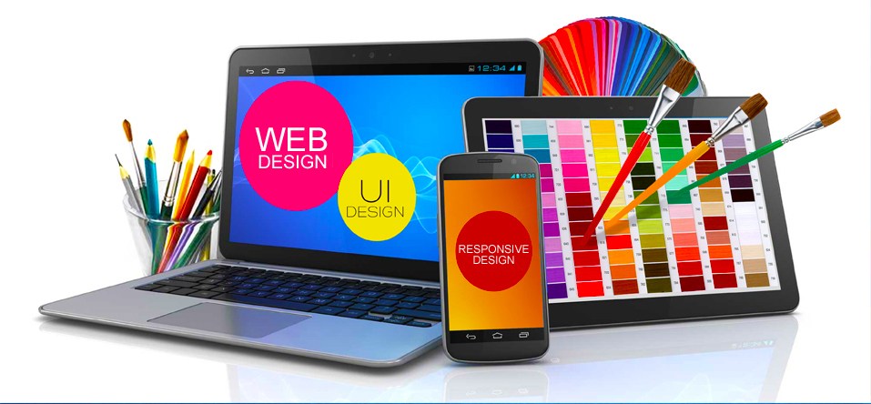
Color
Color is naturally essential to any web page. Whatever colors you choose to have on your
website, they should leave a strong impression upon site visitors in one way or another. There is no hard and fast rule. But generally speaking, bright colors tend to denote energy and strong emotion, while darker and subdued shades create a calmer, contemplative tone.
Selective use of color can be utilized to attract a visitor’s attention to a certain part of your page, most usefully a CTA (Call to Action) like ‘Subscribe Here.’
Picking the right pallet is an intricate business. It is worth taking your time and gathering
feedback before going ‘live.
Prime Real Estate on Screen
It is important to understand where the majority of people look first and for longest on their screen. Perhaps conversely to what you may believe, this is not completely random. Most people spend the longest time looking up in the top left hand corner, and the least time in the bottom right– this has become a natural reflex, as opposed to people purely being guided by the design of a site to look in certain places. By gathering a comprehensive impression of where people’s focus should be, you can locate the highest-value real estate of your web page.
Negative Space
A tidy room fosters a tidy mind, they say. The same goes for web pages. Ensure that on every page of your site there is enough white space, sometimes referred to as ‘negative space.’ People will be quickly turned off by cluttered pages. Do not fill every pixel of the screen with pictures, widgets and text. Instead prioritize the most important aspects and allow them space to stand out and be counted. Essentially, negative space is only ever a positive.